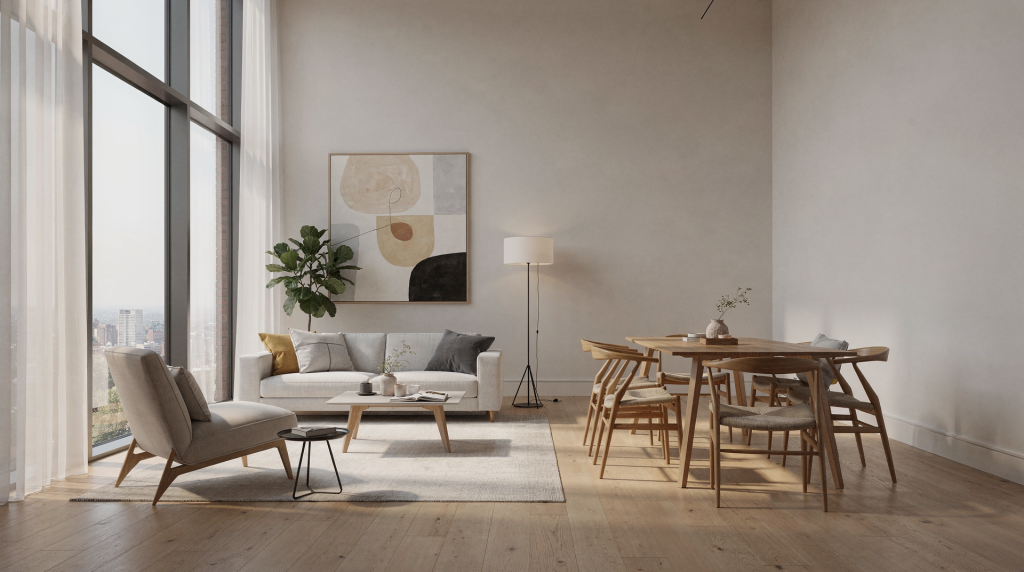
A room never just sits there passively. It speaks. The angle of a sofa in relation to a window, the way morning light cuts across oak floorboards, the deliberate emptiness of a corner — these are not neutral details. They form a visual language that viewers read in seconds, often before they consciously register a single piece of furniture. In interior photography and property presentation, understanding that language is what separates images that merely record a space from images that explain it.
Visual grammar gives you the syntax. It is the underlying structure that makes a room feel intentional rather than accidental, calm rather than chaotic. When the grammar works, someone scrolling through a listing doesn’t just see a living room — they instinctively understand how it lives.
What “visual grammar” means in interiors
Visual grammar is the organizing intelligence behind a room photograph. It is what makes an image feel balanced, legible, and purposeful within the first half-second of viewing. In practice, it weaves together composition, light, scale, rhythm, and hierarchy so the viewer’s eye moves through the frame in a way that feels effortless — and lands exactly where you intend.
I think of it as the difference between a snapshot that says “here is a room” and a photograph that says “here is how this room works.” One documents; the other interprets. For agents and photographers, that distinction carries real weight: a grammatically sound image builds trust, suggests competence, and invites the viewer to imagine themselves inside the frame.
The core elements
- Line: walls, door frames, countertops, stair rails, shelving, and sightlines — the directional cues that pull the eye through the composition
- Shape: the geometry of furniture, windows, rugs, and architectural details — what gives a room its visual character beyond surface finishes
- Scale: how large one element feels relative to another, and whether that relationship reads accurately in two dimensions
- Balance: whether visual weight feels evenly distributed or deliberately asymmetrical — both can work, but only when intentional
- Rhythm: repetition of forms, materials, or spacing that creates a sense of order without monotony
- Hierarchy: what becomes the focal point and what recedes into supportive roles — the visual equivalent of knowing where to put the period in a sentence
- Negative space: the breathing room around objects that prevents the eye from feeling trapped or overwhelmed
A strong interior photograph deploys these elements the way a well-constructed paragraph uses punctuation: not as decoration, but as clarification. Remove the commas and periods from a complex sentence, and meaning collapses. Remove visual hierarchy and negative space from a room photograph, and the space feels confused — even if every piece of furniture is beautiful.
Why it matters in rooms and living spaces
Rooms are judged at scanning speed. Buyers, guests, clients, and casual viewers rarely study a space slowly on first encounter. Their eyes sweep across the image in a fraction of a second, searching for cues about size, flow, and feeling. If the visual structure is muddled, the room will register as smaller, busier, or less functional than it actually is — and that impression sticks.
Good visual grammar helps a room communicate several things simultaneously:
- how movement works through the space
- how large the room genuinely feels
- where the eye should land first
- whether the atmosphere reads as calm or chaotic
- how the architecture supports daily living rather than fighting it
For real estate photography, none of this is abstract theory. It directly shapes whether a listing feels inviting and trustworthy or cold and transactional. A photograph with clear grammar tells the viewer: someone understood this room before they photographed it. That subtle message matters enormously when a buyer is deciding which properties to visit. For interior and architectural work, visual grammar also determines whether the photograph expresses the character of the room — its particular light, its material presence, its emotional temperature — instead of flattening it into a generic interior shot that could be anywhere.
The visual logic of a room
Every room has an internal logic, a kind of spatial argument about what matters most and how the parts relate. Your job as the photographer is to find that logic before you raise the camera. Walk in. Stand still. Let the room tell you what it is trying to say. Then compose around that.
1. Identify the anchor
The anchor is the element that gives the room its meaning — the piece around which everything else organizes itself. In a living room, it may be the seating group, the fireplace, or a dramatic window wall. In a kitchen, it is often the island or the range, sometimes the relationship between prep zones. In a bedroom, the bed almost always becomes the anchor by default, though window placement and architectural features can shift that.
Ask yourself three questions before you set up:
- What is this room actually for?
- What would a viewer need to understand first to make sense of the space?
- Which element tells the story of the room most honestly?
If you cannot answer those questions clearly, the photograph will not be clear either.
2. Read the flow
Flow is how the room connects from one side to another — the implied pathways that someone would walk if they were standing inside the space. A good composition makes that movement visible without overstuffing the frame. You want the viewer to sense where they would enter, where they would pause, and where they would naturally move next.
Look specifically for:
- entries and exits — doorways, archways, open thresholds
- pathways around furniture groupings
- adjacency to other rooms — dining areas, hallways, outdoor spaces
- sightlines to windows or key architectural features
When flow is legible in a photograph, the room feels larger and more functional. When it is blocked or ambiguous, the space can feel cramped even if the square footage is generous.
3. Show structure, not just decoration
A room can be styled beautifully and still photograph badly if its underlying structure is unclear. I have walked into gorgeously furnished spaces that turned into visual soup through the viewfinder because the photographer chased the styling instead of the bones of the room. The best images reveal how the room is built and how it is used — the architecture first, the decoration second.
That usually means showing:
- at least part of two walls when possible, to establish spatial orientation
- enough floor to give a sense of scale and groundedness
- enough ceiling to preserve proportion and avoid a cramped crop
- architectural edges — door casings, window frames, baseboards — that guide the eye through the composition
Decoration should support the structure, not obscure it. If a throw pillow or a vase is the first thing the viewer notices, the grammar has probably slipped.
Composition rules that work in living spaces
Rules in visual grammar are not rigid formulas. They are patterns that have proven reliable across thousands of rooms and hundreds of shoots. Learn them first. Then you will know exactly when and why to break them.
Use corners and doorways with purpose
Corner and doorway viewpoints are workhorses of interior photography for a reason: they reveal depth. A corner angle lets you show how a room opens up, how its main features relate to each other spatially, and how circulation moves through the space. It is one of the most efficient ways to communicate volume and layout in a single frame.
Use a corner angle when you want to:
- establish scale quickly
- include multiple walls for spatial context
- show the relationship between seating, windows, and circulation paths
- make a room feel more complete rather than fragmented
Use a doorway view when you want to:
- frame the room naturally with architectural elements
- create a sense of transition and discovery
- show how one room leads into another — a narrative of movement
One caution: avoid the temptation to force the camera into a position that captures every single element at once. That usually produces a flat, crowded image with no hierarchy — the visual equivalent of a run-on sentence. A photograph that tries to say everything ends up saying nothing clearly.
Keep verticals straight
Interior spaces are full of vertical lines: wall edges, window frames, cabinet fronts, door casings, columns. These lines function as a kind of visual skeleton. If they tilt, the room instantly feels less stable — and viewers may not know why, but they will feel that something is off.
Keep the camera level whenever possible. If you must tilt slightly to include a ceiling detail or floor pattern, correct perspective carefully in post-production. Straight verticals make the space feel calm, deliberate, and professionally handled. They signal competence before the viewer even registers the furniture.
A simple test
If the room looks like it is leaning, the viewer notices the error before the architecture. That is a failure of grammar, not a failure of gear.
Build around one clear focal point
A room photograph needs a primary subject. Without one, the viewer’s eye scans aimlessly, bouncing from object to object without landing anywhere. That creates a low-grade visual anxiety that undermines the entire image.
Possible focal points include:
- fireplace with surrounding millwork
- sofa grouping anchored by a coffee table
- kitchen island with pendant lights above
- bed centered under art or against a feature wall
- window with strong natural light pulling the eye
- statement chair or artwork that defines the room’s character
- staircase landing with architectural presence
A good focal point does not mean everything else disappears. It means everything else supports the main reading of the room — secondary elements recede just enough to let the anchor hold the frame. That is hierarchy in action.
Use layering to create depth
Layering gives an interior photograph dimension. It places visual elements in the foreground, middle ground, and background so the image feels spatially believable — like a room you could step into, not a flat diagram of a room.
| Layer | What it does | Examples |
|---|---|---|
| Foreground | Adds entry into the scene and establishes depth immediately | chair edge, doorway frame, table corner, plant frond |
| Middle ground | Carries the main subject and anchors the composition | sofa, island, bed, desk, dining table |
| Background | Establishes context and completes the spatial story | window, artwork, adjoining room, shelving, architectural detail |
A strong layered image feels inhabitable. A flat image feels like an inventory. The difference often comes down to whether the photographer thought about depth as a storytelling tool or simply framed the room at eye level and pressed the shutter.
Balance does not always mean symmetry
Symmetry can work beautifully in interiors, especially in formal rooms, bathrooms with centered vanities, and architectural compositions built around a strong central axis. But balance is more important than symmetry — and they are not the same thing.
You can balance a room with:
- a large sofa offset by a floor lamp and side table on the opposite side
- a bed centered under art with mismatched nightstands that carry equal visual weight
- a kitchen island balanced by pendant lights above and open floor space around it
The question is not “Is everything mirrored?” It is “Does the frame feel stable?” A composition can be asymmetrical and still feel perfectly resolved. In fact, deliberate asymmetry often reads as more sophisticated and less staged than rigid symmetry — it suggests a room that is lived in, not just arranged for the camera.
Room-by-room reading guide
Different rooms demand different grammatical approaches. The visual logic that works for a kitchen will not necessarily serve a bedroom, and hallways require an entirely different kind of attention. Here is how I read each space before composing.
Living room
Living rooms often need the clearest mix of comfort and structure. The seating arrangement is usually the anchor, but the best image also shows how the room connects to windows, fireplaces, or adjacent spaces. You are not just photographing furniture — you are photographing the idea of gathering.
What to emphasize
- seating group as the social center
- fireplace or media wall as architectural anchor
- natural light source and how it shapes the mood
- connection to dining area, hallway, or outdoor space
Common mistake
Trying to include every chair, side table, pillow, and accessory in a single frame. The result is visual noise, not hospitality. Edit the frame the way you would edit a sentence: keep what serves the meaning, remove what distracts.
Kitchen
Kitchen composition works best when the room’s function is immediately obvious. Islands, ranges, sinks, and cabinetry lines all help tell that story. This is a workspace first, and the photograph should honor that without making the room feel cold.
What to emphasize
- island or primary prep zone as the functional anchor
- cabinet alignment and the rhythm of millwork
- sightline to the next space — dining, living, or pantry
- clean reflective surfaces without distracting highlights
Common mistake
Shooting too wide and losing clarity in the cabinetry, appliances, and countertop edges. A kitchen needs structure more than spectacle. If the viewer cannot quickly read where the work happens, the photograph has failed its primary job.
Bedroom
Bedrooms rely on calm, balance, and proportion. The bed is often the anchor, but the frame should also explain the room’s usable space — the circulation around the bed, the relationship to windows, the presence of a sitting area or adjoining bath.
What to emphasize
- bed placement and how it anchors the room
- bedside symmetry or intentional asymmetry
- window light and how it softens the space
- adjoining bath or sitting area when relevant to the story
Common mistake
Overstyling the bed until the room feels staged instead of restful. A bedroom photograph should invite rest, not announce a photo shoot. Too many pillows, overly arranged throws, and excessive accessorizing can kill the very calm the room is meant to convey.
Hallways and stairwells
These spaces are often treated as filler — transitional areas that get a quick snapshot on the way to the “real” rooms. But hallways and stairwells are important parts of a home’s visual grammar. They control transition, pacing, and anticipation. A well-photographed hallway pulls the viewer through the house; a poorly photographed one stops momentum cold.
What to emphasize
- lines that lead forward and create directional pull
- repetition in doors, rails, or light fixtures that establishes rhythm
- the sense of movement through the space
Common mistake
Ignoring them completely or photographing them without a clear direction. A hallway shot with no vanishing point, no leading lines, and no sense of where it goes is just a narrow room with no purpose.
Lighting as part of the grammar
Light is not just exposure. It is a structural tool — one of the most powerful elements in visual grammar. Light defines shape, creates depth, sets mood, and establishes hierarchy. A room photographed under flat, even light loses its sculptural quality. A room photographed with intentional light gains presence.
Natural light
Natural light is usually the clearest way to describe a room. It reveals texture — the grain of wood, the nap of a rug, the subtle variation in wall color — and creates a believable sense of time and atmosphere. A sunlit living room feels like morning; a softly lit bedroom feels like evening. Those associations work on viewers whether they are conscious of them or not.
Use natural light to:
- show window placement and orientation
- soften surfaces and make materials feel tactile
- connect interior and exterior context — a glimpse of trees or sky through glass
Artificial light
Artificial light can support a room beautifully, but mixed color temperatures can make a scene feel messy and unresolved. Warm lamps, cool daylight spilling through windows, and yellow overhead lights all competing in the same frame create visual static. The eye does not know which temperature to trust.
Check for:
- color casts on white walls — are they reading as cream, blue, or green?
- hot spots on reflective surfaces — countertops, glass, polished floors
- shadows that break up the room’s clarity rather than defining its form
Practical rule
If the lighting changes the room’s mood in a confusing way — if it makes a warm space feel cold, or a calm space feel harsh — simplify the light before shooting. Turn off overhead fixtures, close blinds partially, or wait for the right time of day. Light should clarify the room’s character, not contradict it.
Styling choices that improve visual readability
Styling should support the room’s grammar, not overwhelm it. I have seen beautifully composed photographs undone by a single misplaced object — a bright plastic bottle on a nightstand, a tangle of cables under a desk, a throw pillow that pulls the eye away from the anchor. Styling is editing, not decorating.
Useful styling principles
- leave breathing room around the anchor — negative space is not emptiness, it is clarity
- repeat materials or colors lightly for cohesion — a ceramic vase that echoes the tone of a wooden beam
- remove objects that interrupt lines or sightlines — a chair that blocks the view to a fireplace
- keep surfaces edited down to what matters — a kitchen counter with one beautiful object reads better than one with ten
What to remove
- cables and cords
- bins and wastebaskets
- overly bright packaging
- random toiletries and personal items
- clutter on counters and tables
- anything that pulls attention away from the room’s main story
A good room is not empty. It is edited. The distinction matters. An edited room still feels lived in — it just does not ask the viewer to sort through visual noise to understand the space.
A practical workflow for reading a room
Over years of shooting interiors, I have developed a mental workflow that I run through before I ever touch the camera. It takes about two minutes and it consistently produces stronger compositions than walking in and starting to shoot.
Before you pick up the camera
- Stand in the room and identify the anchor. What is this space about?
- Trace the main sightlines with your eyes. Where does the room want you to look?
- Note where the light is strongest and where it breaks. Where are the shadows falling?
- Look for verticals that need to stay clean — door frames, window casings, cabinet edges.
- Decide whether the room needs breadth, depth, or detail. Not every room needs the same treatment.
While composing
- Choose a viewpoint that explains the room first, flatters it second.
- Keep the camera level — check the bubble level or grid lines.
- Include enough structure to show scale — floor, ceiling, at least part of two walls.
- Remove distractions from the frame edges — check all four corners before you shoot.
- Check whether the main subject is obvious in three seconds or less. If you have to explain it, recompose.
After the first frame
- Ask whether the image reads clearly without explanation. Show it to someone if you can.
- Check balance, not just sharpness. Does the frame feel stable?
- Compare wide, medium, and detail views. Does each serve a distinct purpose?
- Make sure every image has a job. No filler frames.
Hero shot, supporting shot, detail shot
A strong interior set usually needs more than one viewpoint. Relying solely on wide hero shots flattens the narrative. The room becomes a spectacle rather than a space with texture, detail, and context.
| Shot type | Purpose | Best use |
|---|---|---|
| Hero shot | Shows the room at its strongest, most complete | listing cover image, portfolio opening frame |
| Supporting shot | Explains layout or function from a different angle | secondary listing image, blog support image |
| Detail shot | Highlights material, mood, or craftsmanship | finishes, joinery, styling, texture studies |
The mistake many shooters make is using only hero shots — wide, dramatic, impressive. But a room needs context and close reading, not just spectacle. A detail shot of worn brass hardware or morning light across a kitchen counter can do emotional work that a wide shot cannot. Together, the three shot types form a complete visual paragraph.
Typical mistakes that weaken a room’s visual grammar
Over the years, I have seen the same mistakes surface again and again — in listing photos, in portfolios, in otherwise well-intentioned interior work. Most of them are not technical failures. They are grammatical failures. The image is sharp, well-exposed, and compositionally lost.
- Choosing a viewpoint with no clear subject — the eye wanders because nothing anchors it
- Cropping out the architectural cues that show scale — no floor, no ceiling, no wall edges
- Tilting vertical lines — the room feels unstable even if the viewer cannot articulate why
- Including too many props or decorative objects — visual clutter reads as chaos
- Ignoring the room’s flow — pathways are blocked or invisible
- Using lighting that flattens depth — everything sits on the same visual plane
- Centering everything automatically — symmetry applied without intention
- Making the room look larger at the expense of accuracy — wide-angle distortion that breaks trust
If an image is technically sharp but emotionally unclear, the grammar failed somewhere. The fix is rarely more gear or more editing. It is usually simpler: slow down, read the room, and compose with intention.
Quick checklist for room composition
I use this checklist on every shoot. It takes seconds to run through mentally and catches most grammatical errors before they become permanent.
- Is there one clear anchor?
- Do the lines feel clean and intentional?
- Can the viewer understand the room’s function quickly?
- Is the frame balanced without feeling rigid?
- Does the image show depth — foreground, middle ground, background?
- Are distracting objects removed?
- Does the light support the room’s mood?
- Does the photo feel true to the space, or does it feel like a trick?
That last question matters more than many photographers admit. A photograph can be beautiful and still feel dishonest — too wide, too bright, too staged. Visual grammar is not about deception. It is about clarity. The best interior photographs feel true to the space because they are.
When to break the rules
Good visual grammar is flexible. It is a framework, not a cage. You do not have to photograph every room the same way, and the most memorable interior images often come from knowing exactly when to step outside the usual patterns.
Break the usual rules when:
- a dramatic window deserves stronger asymmetry — let the light dominate the composition
- a narrow room needs a more frontal view — a corner angle would only emphasize the tightness
- a stairwell benefits from vertical emphasis — shoot portrait orientation and let the lines climb
- a detail shot is meant to feel abstract — texture and material become the subject, not the room
- a design feature is intentionally unconventional — the photograph should honor that, not correct it
The rule is not “always use symmetry” or “always shoot from a corner.” The rule is: choose the composition that best explains the space. If breaking a convention serves that goal, break it without hesitation. The grammar exists to serve the room, not the other way around.
FAQ
What is the easiest way to improve room photos?
Start by keeping the camera level, simplifying the frame, and choosing one clear focal point. These three adjustments alone will transform more images than any new lens or editing technique.
Should every room be shot from a corner?
No. Corners are useful for revealing depth and layout, but they are only one option. Some rooms read better from a more frontal perspective, especially narrow spaces or rooms with strong symmetrical architecture. Use corners when they help explain the space, not out of habit.
How many walls should be visible in an interior photo?
Usually at least part of two walls helps show scale and orientation, but the best answer depends on the room and the story you need to tell. A detail shot may show only one surface. A wide hero shot may include three. The question is whether the viewer understands the spatial envelope, not whether you hit a specific number.
Why do some room photos feel flat even when they are sharp?
They often lack hierarchy, depth, or a clear anchor. Sharpness alone does not create visual structure. A photograph can be technically perfect and still feel lifeless if the grammar is missing — no foreground, no focal point, no sense of spatial order.
What is the biggest mistake in real estate interior photography?
Overloading the frame. Too many objects, too many competing lines, and no clear focal point make a room harder to understand, not more impressive. The viewer’s eye has nowhere to rest, so it moves on — often to the next listing.
Conclusion
The visual grammar of rooms and living spaces is ultimately about clarity. When composition, light, and structure work together, a room becomes easy to read and more persuasive to look at. The viewer does not have to work to understand the space — the photograph has already done that work for them.
Whether the goal is a stronger portfolio image, a cleaner listing photograph, or a more thoughtful interior essay, the same principle applies: show the room in a way that reveals how it lives. Not how it was staged. Not how it was lit. But how it lives — its proportions, its light, its flow, its particular way of holding space. That is what visual grammar, at its best, makes visible.