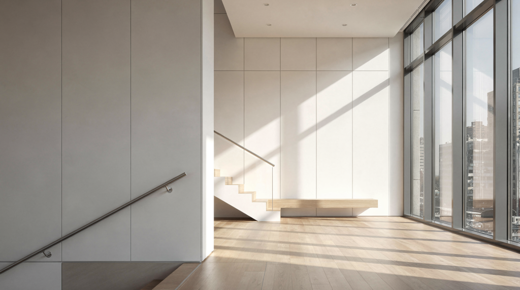
Introduction
When someone says a room “feels good,” they are rarely talking about square footage or paint color alone. They are responding to a constellation of small, often unnamed elements: the rhythm of windows along a wall, the depth of a shadow line where the ceiling meets the crown molding, the way a staircase turns and invites movement upward, or the quiet transition from wood floor to stone tile. These are architectural details, and they do more than finish a space—they organize how we see, how we move, and how we remember.
For anyone who photographs, markets, or prepares property for sale, this isn’t abstract theory. It’s the difference between an image that merely documents a room and one that makes a viewer understand the room’s character in a single frame. A well-placed detail can make a modest living room feel taller and more gracious; a poorly handled one can flatten a generous space into visual confusion. Learning to read these cues—and to use them deliberately—turns a listing into a visual story.
What architectural details actually do
Architectural details are the mid-scale and small-scale elements that give a building its legibility: baseboards, crown moldings, window mullions, door casings, stair railings, ceiling beams, built-in shelving, alcoves, material thresholds, and the way plaster meets glass. They matter because nobody experiences a room as an empty volume. The eye instinctively searches for edges, contrasts, and relationships. Details provide the reference points that let us judge scale, depth, and order.
In practice, details shape visual experience in four fundamental ways:
- They establish scale. A room’s perceived size depends on cues like the height of a baseboard relative to the wall, the proportion of windowpanes, or the thickness of a ceiling beam. Without these references, the eye has nothing to measure against, and even a large room can feel oddly dimensionless.
- They create rhythm. Repeating elements—a row of identical windows, evenly spaced beams, a sequence of archways—give the eye a predictable path. This repetition reads as calm and intentional, which is why it photographs so well.
- They direct movement. A staircase pulls the gaze upward; a long sightline framed by pilasters invites you to walk through; a change in flooring material signals a shift in function. Details act as visual cues that guide both physical movement and the viewer’s attention across a photograph.
- They shape mood. Texture, sheen, shadow, and color temperature all contribute to the emotional register of a space. A rough brick wall catches light differently than a polished plaster surface, and that difference registers as warmth, austerity, intimacy, or formality.
Why details change perception
1. They define scale
Square footage tells only part of the story. The eye judges size by comparing objects to architectural boundaries. Tall wainscoting, vertical shiplap, or narrow window muntins can pull the eye upward and make an eight-foot ceiling feel higher. Conversely, wide, heavy crown molding or oversized furniture can compress the perceived height. When I photograph a room, I pay attention to where the strongest vertical lines fall—often a doorframe or a window edge—and use them to anchor the composition. If those lines are clean and uninterrupted, the room reads as taller and more ordered.
2. They organize the visual field
We read spaces by separating figure from ground, foreground from background, dominant forms from secondary ones. Architectural details provide the boundaries that make this separation possible. A chair rail divides a wall into two distinct visual planes; a change in flooring marks the transition from entry to living area; a ceiling beam defines the top of a volume. When these cues are weak or missing, the room can feel visually flat, no matter how much furniture or decor is present. In photographic terms, a space without clear figure-ground relationships often results in an image where nothing holds the eye, and the viewer scrolls past without engaging.
3. They influence light behavior
Light doesn’t simply fill a room; it reveals architecture. A deep window reveal creates a soft gradient of shadow that adds depth to a wall. A coffered ceiling catches light on its beams and casts subtle shadows into the recesses, making the ceiling feel more dimensional. Glossy surfaces reflect light and can make a small space feel more open, while matte textures absorb light and create a quieter, more grounded atmosphere. When I’m on site, I watch how light moves across moldings, stair treads, and material transitions throughout the day. The same room shot at 10 a.m. and 4 p.m. can tell entirely different stories, purely because the details interact with light differently.
4. They carry emotional cues
Curves tend to read as softer, more relaxed, and more organic; sharp, precise alignments feel formal and controlled. Warm wood tones and textured plaster often signal comfort and approachability, while cool stone, steel, and glass can evoke calm restraint or clinical precision. These responses aren’t universal, but they are consistent enough to matter in both design and photography. A photographer who understands these associations can choose angles and lighting that either amplify or soften the emotional tone of a space, depending on the story the listing needs to tell.
The details that matter most in real spaces
| Detail type | Visual effect | What to watch for |
|---|---|---|
| Moldings and trim | Frame walls and openings; establish scale and rhythm | Overly ornate profiles can compete with focal points; inconsistent styles across rooms break visual continuity |
| Windows and mullions | Control light, symmetry, and the cadence of a façade or interior wall | Heavy grid patterns can fragment a view; thin mullions tend to photograph as cleaner, more modern lines |
| Staircases and railings | Introduce movement and vertical emphasis; often the most dynamic sculptural element in a home | Clutter on treads or landings weakens the line; shoot from below or above to exploit the geometry |
| Ceiling transitions | Change perceived height and define room hierarchy | Uneven or poorly lit transitions can make a room feel awkward; a clean shadow line adds crispness |
| Built-ins and cabinetry | Create order, continuity, and a sense of permanence | Misaligned doors or inconsistent hardware read as carelessness; symmetry here pays off in wide shots |
| Material changes | Signal zones, function, and flow between areas | Too many finishes in one sightline create visual noise; a deliberate threshold can be a strong compositional element |
| Arches, alcoves, and recesses | Add depth, intimacy, and a sense of discovery | Dark recesses need careful exposure or supplemental light; an arch can frame a distant view beautifully |
How to read a space like a photographer
A photographer doesn’t just record what’s there; they translate three-dimensional architecture into a two-dimensional image that still feels spacious, coherent, and emotionally true. That translation starts with identifying which details carry the story of the room and which ones are visual static.
Start with three questions
- What is the strongest visual idea in this room? Is it the symmetry of a fireplace flanked by windows? The sweep of a staircase? The texture of an exposed brick wall?
- Which single detail gives the room its character? It might be original millwork, a vaulted ceiling with exposed beams, or a row of steel-framed doors.
- What is distracting from that idea? A piece of furniture blocking a sightline, a tangle of cords, a reflective surface throwing glare—anything that pulls attention away from the architecture.
Then look for these cues
- Leading lines that pull the eye toward a natural focal point: a hallway that converges on a window, a banister that curves toward a landing, a beam that points to a fireplace.
- Repetition that creates calm and structure: a series of identical pendant lights, evenly spaced rafters, a grid of windowpanes.
- Contrasts in texture or tone that create depth: rough stone against smooth plaster, dark wood against pale walls, matte tile next to glossy cabinetry.
- Transitional elements—thresholds, cased openings, stair landings—that reveal the next space and suggest a journey through the home.
A simple rule
If a detail explains the room—if it helps a viewer understand the scale, the era, the quality, or the flow—keep it prominent in the frame. If it adds noise without meaning, simplify the composition. Often, moving the camera a foot to the left or right is enough to eliminate a distracting element while preserving the architectural story.
Architectural details in common room types
Entryways
The entry sets the emotional tone for the entire property. Door proportions, sidelights, ceiling height, flooring transitions, and the first sightline into the main living area all work together to create an impression of generosity or constraint. A narrow foyer can still feel strong if the details are crisp and aligned: a tall door with clean casing, a well-lit ceiling, and a clear view through to a brighter space beyond. When photographing entries, I often shoot from a low angle to emphasize verticality and include a sliver of the next room to create a sense of invitation.
Living rooms
Symmetry and focal balance dominate here. A fireplace centered between matching windows, built-in bookcases flanking a sofa, or a beam grid that aligns with furniture arrangement all help the viewer understand the room quickly. The danger is over-styling: too many accessories, layered rugs, or oversized art can bury the architecture. I prefer to let the strongest architectural feature—often the fireplace or a window wall—anchor the composition, and then arrange or frame the shot so that secondary elements support rather than compete with it.
Kitchens
Cabinet proportions, hardware alignment, backsplash geometry, and the edge profile of an island all influence how orderly a kitchen feels. Repetition is especially powerful here: a consistent row of cabinet pulls, a uniform tile pattern, or a clean line of under-cabinet lighting reads as premium and intentional. Even in modest kitchens, straightening the lines—making sure cabinet doors are closed, aligning bar stools, clearing counter clutter—can dramatically improve the visual impression. I often shoot kitchens from a corner to show two walls of cabinetry, using the island as a foreground anchor that leads the eye into the space.
Staircases
Stairs are one of the most expressive architectural features in any home. They introduce movement, vertical scale, and often provide a natural photographic vantage point. A well-designed staircase with a clean railing, open risers, or a graceful curve can become the hero shot of a listing. When photographing stairs, I look for the angle that best reveals the form: shooting up from the bottom step emphasizes ascent and volume; shooting down from a landing can showcase the geometry of treads and railings. The key is to keep the area free of visual clutter so the eye can follow the line without interruption.
Bathrooms
In smaller rooms, every detail carries more weight. Tile layout, mirror edges, fixture finishes, and lighting placement all affect whether the room reads as refined or cramped. A well-composed bathroom image depends on making every line feel intentional. I often use a wider lens to capture the full vanity and shower area, but I’m careful to keep verticals straight and avoid distorting the edges of tiles or mirrors. Reflective surfaces demand attention: a slight shift in camera position can eliminate glare on a glass shower door or a polished chrome faucet.
Common mistakes that weaken visual experience
- Overdecorating a room until the architecture disappears behind accessories, textiles, and art.
- Ignoring symmetry when the room’s structure clearly depends on it—for example, placing a sofa off-center relative to a fireplace or window grid.
- Cropping too tightly and losing the moldings, ceiling lines, or floor transitions that give the room scale and context.
- Photographing reflective surfaces without controlling glare, which turns a sleek kitchen or bathroom into a confusing patchwork of highlights.
- Presenting mismatched finishes—such as three different wood tones in one sightline—without acknowledging the visual break they create.
- Letting furniture block key architectural transitions, like a sofa pushed against a cased opening or a chair obscuring a stair newel post.
How to use architectural details better in property presentation
For agents
- Identify the top three architectural details that make the property memorable—these are the features you’ll mention in conversation and in listing copy.
- Ensure those details are clearly visible in at least one hero shot and several supporting images. If the original millwork is a selling point, show it in context and in a close-up.
- Use staging to support architecture, not cover it. Furniture should frame a fireplace, not block it; rugs should define zones without hiding floor transitions.
- Write listing descriptions that name the feature precisely: “original crown molding,” “barrel-vaulted ceiling,” “custom built-ins with integrated lighting.” Specificity builds buyer confidence.
For photographers
- Scout the property for details before choosing angles. Walk each room and note the strongest lines, the most interesting material transitions, and the features that give the space its identity.
- Shoot both wide establishing views and tighter detail frames. A wide shot shows the flow; a detail shot of a handrail bracket or a tile pattern adds texture and craft to the visual story.
- Keep verticals straight. Converging lines can work in fine-art photography, but in real estate, they make architecture feel unstable. Use a tilt-shift lens or correct in post.
- Use light to reveal texture, not flatten it. Side light from a window can bring out the grain of wood floors or the relief of a plaster wall; avoid front-on flash that washes out shadows.
- Include transition shots between rooms when they tell the story of the home. A view from the living room through a cased opening into a sunlit dining area creates a sense of connection and flow.
For homeowners preparing a space
- Clear visual clutter around doors, stairs, windows, and built-ins. These are the areas where the eye naturally goes, and obstructions there are disproportionately distracting.
- Replace mismatched or dated hardware if it breaks the visual rhythm—consistent cabinet pulls and door handles make a surprisingly strong impression.
- Clean lines, corners, and reflective surfaces before the shoot. Dust on baseboards, smudges on mirrors, and fingerprints on stainless steel become glaring flaws in high-resolution images.
- Open drapes and blinds fully to let the architecture breathe. Natural light reveals the depth of window reveals, the texture of walls, and the true proportions of the room.
Practical checklist: evaluating a room
Use this quick checklist before photographing or presenting any space:
- Are the strongest architectural details visible from the main viewpoint?
- Do the lines feel intentional and aligned, or do they seem accidental?
- Is there enough contrast—light against shadow, smooth against textured—to show depth?
- Are transitions between materials clean and deliberate?
- Does the furniture support the architecture, or does it hide key features?
- Does the room still make visual sense in black and white? If the structure falls apart without color, the composition may rely too heavily on decor rather than on the bones of the space.
Quick comparison: strong details vs. weak presentation
| Strong presentation | Weak presentation |
|---|---|
| Clear focal points that anchor the eye | Competing visual elements with no hierarchy |
| Clean transitions between materials and planes | Abrupt, unresolved edges that confuse the boundary |
| Balanced light and shadow that reveal form | Flat, even exposure that hides texture and depth |
| Repeated forms and rhythms that create calm | Random visual interruptions that break the flow |
| Details that reinforce the sense of scale | Details that obscure or contradict the room’s true size |
Why this matters in real estate photography
In real estate photography, architectural details are not decorative extras—they are the evidence that helps a viewer believe in the space. A listing photo that shows only furniture and general layout misses the deeper story. It tells a buyer what the room contains, but not what the room is. A stronger image uses details to communicate quality, proportion, and atmosphere in a single frame: the way morning light rakes across a shiplap wall, the shadow line of a coffered ceiling, the patina of original hardwood floors.
That’s why the best property images rarely feel overloaded. They feel legible. The architecture can be read at a glance—the scale, the flow, the materiality—but it also rewards a second look. A buyer scrolling through dozens of listings may not consciously notice the crown molding or the stair rail detail, but those elements register nonetheless. They create a sense of substance and care that generic, detail-free images cannot replicate.
Conclusion
Architectural details shape visual experience by giving spaces structure, rhythm, depth, and emotional tone. They help people understand a room faster, feel it more clearly, and remember it longer. For anyone photographing or marketing property, the goal is not simply to show a room, but to reveal how its details work together—how the light falls on a molding, how a staircase pulls the eye upward, how a material change signals a shift in use.
When those details are framed with intention, a functional space becomes a visual story. And in a market where buyers form opinions in seconds, a story well told is the most practical advantage there is.
FAQ
What counts as an architectural detail?
Any feature that helps define the form, rhythm, or character of a building or room qualifies: trim, moldings, window proportions, stair railings, built-in cabinetry, ceiling beams, archways, alcoves, and material transitions from one surface to another. Even the shadow gap between a wall and a floor can function as a detail that shapes perception.
Why do some rooms feel larger than they are?
Rooms feel larger when details support clear sightlines, vertical emphasis, and simple visual organization. Tall baseboards, full-height window treatments, and consistent flooring that runs uninterrupted through multiple spaces all contribute. Conversely, a room with chopped-up trim, busy wallpaper, or furniture that blocks sightlines can feel smaller than its actual dimensions.
Can small details really affect listing performance?
Yes. Small details influence how premium, organized, and inviting a property appears. A misaligned cabinet door or a scuffed baseboard may seem trivial in person, but in a high-resolution photograph, these imperfections can undermine buyer confidence. Conversely, crisp, well-maintained details signal that the property has been cared for, which can translate directly into perceived value.
What should photographers focus on first?
Start with the details that best explain the room: the main focal point, the strongest architectural lines, and the feature that gives the space its identity. Once you’ve identified those, build your composition around them, and then check for distractions that pull attention away. The goal is an image where the architecture speaks clearly, without the viewer having to search for meaning.
How do you avoid overemphasizing details?
Show enough detail to reveal character, but keep the frame readable. If too many features compete—ornate moldings, a patterned floor, a textured wall, and a busy view through the window—simplify the composition. Choose one or two details to lead, and let the rest recede. Often, a slight shift in camera position or a tighter crop is all it takes to calm the visual field while still honoring the architecture.