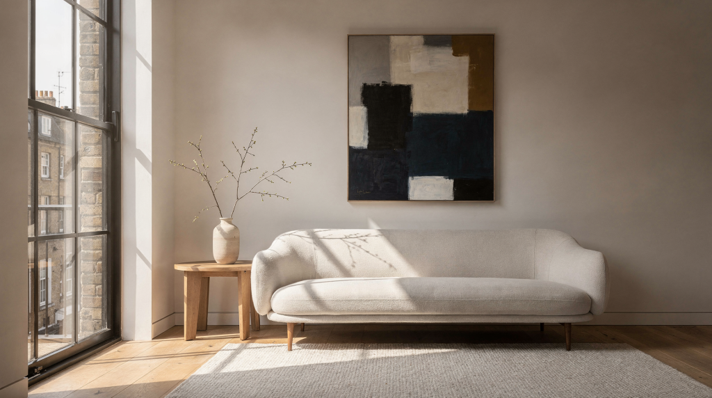
When I moved from fine art and portrait photography into architectural and interior work, the transition felt less like a career shift and more like a change of subject. The same principles that make a painting feel balanced, intentional, and emotionally resonant also make a room photograph—or the room itself—feel clearer, calmer, and more memorable. For photographers, agents, and anyone presenting a space, the lesson is straightforward: rooms are read visually before they are understood functionally. Composition controls that first reading, and it does so with a subtlety that most viewers never consciously notice.
Why fine art composition matters in interiors
A strong interior image does more than record square footage. It guides the eye, explains the layout, and gives the viewer a sense of how the space feels to inhabit. In real estate photography, that often means leaning on the same core ideas found in fine art: balance, rhythm, depth, framing, and visual hierarchy. The biggest mistake in interior presentation is treating the room as a neutral container. In practice, every wall, doorway, lamp, chair, and window contributes to the composition. Once that is understood, the room stops being a record shot and starts becoming a visual story—one that shapes how a potential buyer or guest emotionally connects with the property.
The core composition principles that translate best
1. Balance creates calm
In fine art, balance is not always symmetry. It is the sense that visual weight is distributed in a way that feels stable. Interiors work the same way. A sofa on one side can be balanced by a window, a floor lamp, or a piece of wall art on the other. A room with too many heavy objects on one side feels lopsided, even if the architecture is sound. I often think of portrait composition: placing the subject off-center and balancing the frame with negative space or a secondary element. In a living room, a weighty sectional on the left might find its counterpoint in a tall bookcase or a cluster of windows on the right, creating equilibrium without rigid mirroring.
Use this in practice:
- Avoid crowding one side of the frame with furniture.
- Offset large objects with open space or lighter elements.
- Keep visual weight from “falling” into one corner.
2. Leading lines give the viewer direction
Painters and photographers use lines to guide the eye toward a focal point. In interiors, those lines are everywhere: baseboards, countertops, stair rails, hallway edges, beams, and tile patterns. Straight lines help the viewer understand structure. Diagonal lines can add energy, but they need careful handling—a staircase railing that cuts across the frame at a steep angle can inject dynamism, but if the line terminates in a dark corner, it may make the space feel unresolved. The most successful leading lines in real estate photography often pull the eye toward a light source or an architectural feature, like a window at the end of a hallway or a staircase ascending toward a brighter landing.
Best use cases:
- Hallways that lead into a brighter room.
- Staircases that pull attention upward.
- Countertops or tables that create a path through the frame.
3. Framing adds depth and context
Fine art frequently uses framing devices—arches, windows, foreground objects—to create a sense of looking into a scene rather than at a flat surface. Interior photography benefits from the same approach. A doorway, curtain edge, or partial foreground object can establish depth and help the viewer feel positioned inside the space. I’ve found that shooting through an open door into the next room not only adds layers but also invites a narrative: the viewer becomes an explorer moving from one area to another. Even a sliver of a chair back or a potted plant in the immediate foreground, kept slightly out of focus, can anchor the composition and make the room beyond feel more expansive.
Good framing choices:
- Doorways that reveal a second room.
- Window trim that encloses a view.
- A foreground chair edge or plant used lightly, not as clutter.
4. Negative space lets the room breathe
In painting, empty space is not wasted space. It gives the eye somewhere to rest and helps the important elements stand out. Interiors need that same breathing room. If every inch of the frame is packed with detail, the room may feel smaller and harder to read. Negative space can make a room feel more spacious, more elegant, and more intentional. I often advise agents to think of a blank wall behind a dining table not as “missing decor” but as an active compositional choice that highlights the table’s texture and the pendant light above it. The emptiness carries visual weight of its own.
Watch for:
- Over-decorated corners.
- Furniture pushed too tightly into the frame.
- Walls with too many competing focal points.
5. Rhythm comes from repetition
Fine art composition often uses repeated shapes, colors, or intervals to create movement. Interiors naturally contain rhythm through windows, chairs, pendant lights, stair balusters, or a sequence of archways. Rhythm helps the eye move through a space without getting stuck. It also makes an interior feel coherent. A row of matching pendant lights over a kitchen island establishes a visual cadence that guides the gaze from one end to the other, much like a series of brushstrokes in a painting that lead the viewer across the canvas.
Examples:
- Matching pendant lights over an island.
- Repeated rectangular window shapes.
- A row of dining chairs creating visual cadence.
Fine art lessons that improve interior photography immediately
Shoot with a clear focal point
A painting usually has one dominant idea, even when multiple elements are present. Interior photographs need the same discipline. Every strong room image should answer one question: what is this frame trying to say? It might be the openness of the living room, the architectural detail of a staircase, the light quality near a window, or the relationship between kitchen and dining area. If the answer is unclear, the image is probably trying to do too much. When I walk into a sunlit living room, I often decide within seconds whether the hero of the shot will be the fireplace, the window, or the way the light pools on the floor—and then I build the composition around that choice, letting everything else recede into a supporting role.
Use the frame to support the story, not just record the room
A common mistake in interior photography is standing in the most obvious spot and capturing everything at once. That approach often produces a flat, descriptive image with little feeling. Fine art composition teaches selective seeing. Instead of documenting the entire room in one frame, look for the angle that expresses the room’s strongest quality. I’ll circle a space several times, testing corners and sightlines, until I find the viewpoint that reveals depth without distortion and lets the natural light do its best work. The goal is not to show everything, but to show the right things in the right relationship.
Ask:
- What is the most attractive light source?
- Where does the eye naturally travel?
- Which angle reveals depth without distortion?
- What can be removed from the frame without losing the story?
Think in layers: foreground, middle ground, background
One of the easiest ways to make interiors feel more dimensional is to build the image in layers. In portrait work, a foreground element like out-of-focus foliage creates a sense of immediacy and place. In interiors, a table edge, a chair arm, or a doorway in the immediate foreground serves a similar function, giving the viewer a point of entry before the eye moves deeper into the scene.
| Layer | What it does | Interior example |
|---|---|---|
| Foreground | Creates immediacy and depth | A chair arm, table edge, or doorway |
| Middle ground | Holds the main subject | Sofa, dining table, kitchen island |
| Background | Adds context and scale | Window, fireplace, shelving, artwork |
When all three layers are present, the image feels richer and more spatial. The viewer doesn’t just see a room—they feel positioned within it.
The practical translation: from art principles to room decisions
Composition is not only about photography. It also informs staging and room presentation. Before I ever raise the camera, I walk through the space with an eye for visual noise and accidental imbalance, making small adjustments that pay off enormously in the final image.
What to adjust before the shoot
- Remove visual noise from countertops, tables, and shelves.
- Open up pathways so the room reads clearly.
- Align cushions, chairs, and decor to reduce accidental imbalance.
- Simplify competing colors if the room already has strong architectural detail.
- Let natural light do more of the work before adding artificial fill.
What to check through the lens
- Are vertical lines straight? Even a slight tilt can make a room feel unstable.
- Does the eye know where to land first?
- Is there enough negative space?
- Does the frame show depth, not just surface?
- Does the room feel accurate in scale?
What to avoid
- Crooked horizons and leaning walls.
- Shooting too close to walls, which flattens the room.
- Excessive wide-angle distortion that makes furniture feel stretched.
- Overusing symmetry when the space is more interesting asymmetrically.
- Including too many small decorative objects that distract from the architecture.
A useful rule of thumb for interiors
Fine art composition often favors intention over completeness. That is a helpful mindset for interiors too. A successful image does not need to show everything. It needs to show the right things in the right relationship. That usually means one clear focal area, strong structural lines, enough openness to feel inviting, and a controlled amount of visual complexity. If the image feels busy, the room will feel smaller. If it feels too empty, the room may lose character. The goal is a balance that matches the property’s personality—a kind of visual editing that leaves the viewer curious rather than overwhelmed.
How this changes the way people experience a home
Good composition does more than make a photo attractive. It changes how a viewer reads a property. A balanced room feels more livable. A clear sightline feels more spacious. A calm frame feels more trustworthy. A well-composed sequence of images helps the viewer imagine moving through the home. That is why fine art composition matters so much in interiors: it shapes both perception and emotional response. When the composition is right, the viewer doesn’t just see the room—they begin to feel its atmosphere, its proportions, and its potential as a lived-in space.
Quick checklist for applying fine art composition to interiors
- Choose one primary subject for each frame.
- Use straight verticals and level horizontals.
- Build depth with foreground, middle ground, and background.
- Leave breathing room around important elements.
- Use architectural lines to guide the eye.
- Reduce clutter before you shoot.
- Balance heavy objects with open space or lighter forms.
- Let natural light define the mood where possible.
Common mistakes and how to fix them
| Mistake | Why it weakens the image | Better approach |
|---|---|---|
| Too much included in one frame | The room loses focus | Break the story into multiple images |
| Crooked lines | Makes the room feel unstable | Level the camera carefully |
| Flat, front-on viewpoint | Reduces depth | Shoot from a corner or doorway |
| Overcrowded styling | Distracts from the architecture | Edit the scene down |
| Ignoring negative space | Creates visual tension | Leave areas of rest |
FAQ
Is symmetry always the best choice for interiors?
No. Symmetry can be powerful, but many interiors feel more natural and interesting when they are slightly asymmetrical. The key is balance, not perfect mirroring. A symmetrical composition can convey formality and order, while a carefully managed asymmetry often feels more dynamic and lived-in.
Why do corner shots work so well in rooms?
Corner angles usually reveal two walls, part of the floor, and some depth into the room. That helps the viewer understand the layout faster. The diagonal sightline also creates a sense of movement and space that a straight-on shot often lacks.
Should interiors always follow the rule of thirds?
Not always. The rule of thirds is useful, but interiors often benefit more from structural balance and clear sightlines than from strict grid placement. Sometimes centering a strong architectural element—like a fireplace or a window—creates a more powerful and intentional image.
How can a small room feel larger in photos?
Use clean composition, straight lines, open pathways, and a viewpoint that shows depth. Avoid clutter and avoid placing the camera too close to large objects. A corner perspective that reveals two walls and some floor space can make even a compact room breathe.
What is the most important compositional principle for interiors?
Clarity. If the viewer can quickly understand the room, its scale, and its atmosphere, the composition is doing its job. Everything else—balance, lines, framing—serves that central goal of making the space instantly legible and emotionally resonant.
Conclusion
Fine art composition teaches interiors how to feel intentional. Balance, line, rhythm, framing, and negative space are not abstract art concepts—they are practical tools for showing a room at its best. When those principles are used well, an interior image does more than document a space. It helps people understand it, feel it, and imagine themselves inside it.