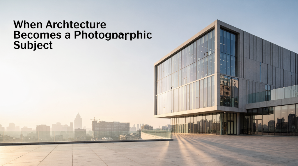
Architecture shifts character the moment it’s photographed with intention. A building stops being merely a structure and turns into a study of line, proportion, light, texture, and movement. For agents, photographers, and anyone building a visual portfolio, this transformation matters because the camera doesn’t just record space — it interprets it. That interpretation shapes how a buyer feels before they ever step through the door.
That’s why architectural photography isn’t about “getting the whole building in frame.” It’s about deciding what the space is trying to say, then using composition and light to make that message unmistakable. A lobby can read as grand or sterile depending on where you stand. A sunlit living room can feel expansive or flat based on how you handle the windows. The difference lies in treating architecture as a subject with its own visual language.
Why architecture works so well as a photographic subject
Architecture offers something many subjects don’t: an organized relationship between form and function. Walls, windows, staircases, corridors, and openings naturally create lines, depth, and rhythm. In photographs, those elements can guide the eye with very little effort — if you know how to look for them. A well-placed doorway becomes a frame within a frame. A row of columns turns into a repeating beat. The structure itself hands you the compositional tools.
Buildings also change throughout the day. Morning light can feel quiet and precise, carving crisp shadows that emphasize geometry. Afternoon light often exposes texture — brick, stone, wood grain — that midday sun can flatten. Twilight softens the scene and makes windows glow, balancing interior warmth against a cooling sky. The same room may read as formal, cozy, minimal, or dramatic depending on when and how it’s photographed. That temporal sensitivity is part of what makes architectural photography endlessly engaging.
For that reason, the genre sits at the intersection of documentation and interpretation. A strong image should answer practical questions — What does the building look like? How is the space arranged? — while also conveying atmosphere. You’re not just showing square footage; you’re showing how the space feels to inhabit.
What makes a building photographically interesting
Not every structure needs the same treatment. The best subjects usually have at least one of these qualities:
- Clear geometry, such as strong verticals, repeated windows, arches, or a defined grid
- Noticeable texture, like stone, brick, concrete, wood, or patina
- Distinct light behavior, including deep shadows, reflective surfaces, or large openings
- A readable flow through space, such as hallways, staircases, or framed views
- A sense of personality, where the building expresses age, restraint, luxury, warmth, or experimentation
If a place feels flat on first glance, look for one of these supporting elements. They often hide in plain sight:
- A corner that reveals two planes at once — instantly adding dimension
- A doorway that creates depth and invites the eye deeper into the frame
- A shadow pattern that adds structure to an otherwise blank wall
- A material change that separates zones, like wood flooring meeting tile
- A window or opening that gives the frame a clear focal point
I’ve walked into countless rooms that seemed unremarkable until I noticed how light fell across a stair tread or how a hallway’s perspective compressed toward a bright window. Those small discoveries turn a routine shot into something worth studying.
The core compositional tools
Architectural photography becomes much stronger when composition is treated as a design decision rather than a technical afterthought. The goal is to make the frame feel intentional — as if every element inside it belongs there.
1. Use symmetry when the building asks for order
Symmetry works especially well for facades, lobbies, staircases, and centered interiors. It creates calm and formality, and it helps viewers understand the structure quickly. A symmetrical lobby shot, for instance, immediately communicates grandeur and stability — qualities many luxury listings rely on.
Use it when:
- The architecture is balanced by design
- You want to emphasize stability or elegance
- The building has a central axis worth celebrating
Be careful with it when:
- One side is visually cluttered
- The building is intentionally asymmetrical
- You cannot keep vertical lines straight — symmetry falls apart if the camera isn’t level
2. Use leading lines to guide attention
Stair rails, hallways, ceiling beams, floor patterns, and roof edges can all direct the viewer toward the main subject. These lines make a photograph feel easier to enter — they create a visual pathway that pulls the eye through the space.
Good leading lines do one of two things:
- Pull the eye toward a focal point
- Create a sense of movement through the space
A corridor photograph, for example, becomes more engaging when the eye is led toward a window, a door at the end, or a light source rather than being trapped in a flat view. I often use the line where a wall meets the floor as a subtle guide, or let a row of pendant lights draw attention toward a kitchen island.
3. Shoot corners for depth
Corner compositions are one of the most useful tools in interior photography because they show two walls and the floor plane at once. That gives the viewer a better sense of scale and dimension than a straight-on shot. A living room photographed from a corner feels more spacious and three-dimensional; you understand how the seating area relates to the windows and the entryway.
This approach works well for:
- Living rooms
- Bedrooms
- Offices
- Small spaces that need depth
- Hallways and transitional areas
When I’m in a tight powder room or a narrow hallway, the corner angle is often the only way to convey the true proportions without making the space feel claustrophobic.
4. Watch the frame edges
A lot of architectural images fail at the edges. A clean center can still feel awkward if there’s a cut-off lamp, a crooked vertical line, a distracting outlet, a sliver of clutter in the background, or a chair leg clipped in an unfortunate place. The edges of the frame act like a container — whatever touches them draws disproportionate attention.
Before pressing the shutter, scan every edge of the frame. In architecture photography, the edges matter almost as much as the center. I’ve learned to run my eye clockwise around the viewfinder: top edge, right edge, bottom, left, then back to the middle. It’s a small habit that prevents big regrets in post-production.
Light is the real subject
In architectural photography, light often matters more than the subject itself. It defines shape, exposes material quality, and changes how the viewer emotionally reads the space. A room bathed in soft side light feels entirely different from the same room under harsh overhead fluorescents.
Natural light usually leads
Daylight is often the most honest way to show a building. It gives accurate color, reveals texture, and preserves a sense of time and place. In interiors, soft natural light generally works better than a room full of mixed artificial sources. I typically turn off overhead lights if they create color casts, open curtains or blinds to control the spill of daylight, and let the brightest source feel purposeful, not accidental. Additional lighting only comes in where shadows become too heavy — and even then, I keep it subtle.
Golden hour adds texture and warmth
The light shortly after sunrise and before sunset is especially useful for architecture because it comes in at a low angle. That angle reveals surface detail and gives depth to facades, masonry, and landscape edges. For a property with a west-facing stone exterior, golden hour can turn a flat wall into a textured canvas. Use golden hour when you want warmth, soft shadows, texture on exterior surfaces, or a more inviting mood. It’s the difference between a house that looks like a listing photo and one that looks like a home.
Side light reveals material character
Side lighting can be more revealing than front lighting because it creates contrast across surface details. This is especially useful for brick, concrete, wood grain, decorative trim, and relief patterns. If a building has rich texture, side light can turn that texture into the main visual feature. I’ve photographed brick townhouses where the only thing that made the shot compelling was the raking light catching every mortar joint and irregularity.
Twilight is useful for interiors with windows
Rooms with many windows often photograph well at twilight, when the brightness inside and outside begins to balance. This helps avoid blown-out windows and overly dark interiors. Twilight is often the best choice when the property has strong exterior views, you want lit interiors with visible sky color, or the building feels strongest when interior and exterior light work together. I’ve shot high-rise condos where the twilight sky turned an ordinary living room into a scene that felt cinematic — the city lights just beginning to glow, the interior warm and controlled.
Architectural photography vs. real estate photography
These two genres overlap, but they don’t aim at exactly the same result. Understanding the distinction helps you decide which approach a project needs.
| Aspect | Architectural Photography | Real Estate Photography |
|---|---|---|
| Main goal | Express form, material, and design | Sell the property clearly and attractively |
| Tone | More interpretive and artistic | More practical and market-focused |
| Composition | Can be more selective and experimental | Usually cleaner and more comprehensive |
| Subject focus | Building as an object or place | Property as a lived-in, desirable space |
| Ideal audience | Editors, designers, architects, art-focused viewers | Buyers, agents, homeowners |
A strong visual portfolio can move between both. Architectural images prove your eye for structure and light. Real estate images prove you can make that eye useful in a commercial context. The best real estate photographers I know borrow heavily from architectural principles — they just apply them with the buyer’s emotional journey in mind.
How to approach a building shoot step by step
A good architectural session starts before the camera comes out of the bag. Preparation is what separates a set of snapshots from a coherent visual story.
1. Read the building first
Walk the site slowly and look for the main axis, repeated forms, best light direction, problem areas, strongest details, and background clutter you may need to remove. Ask one simple question: what is this space most proud of? Maybe it’s a sweeping staircase, a wall of glass, or the way morning light hits the kitchen island. That’s your anchor. Everything else supports it.
2. Choose the story you want to tell
Every building has a visual identity. Some are defined by restraint. Others by ornament, scale, warmth, or transparency. A useful working method:
- If the building feels monumental, emphasize symmetry and scale
- If it feels intimate, emphasize texture and layered depth
- If it feels modern, simplify the frame and respect clean lines
- If it feels historic, pay attention to material character and shadow
I often jot down three adjectives before I start shooting — say, “airy, calm, refined” — and let those words guide every framing decision. It keeps the series cohesive.
3. Control perspective
Architectural photography depends on straight lines. If verticals fall inward or outward too much, the image starts to feel careless. Keep the camera level when possible, use a tripod when you need precise framing, and check verticals before each final frame. Avoid tilting up unless distortion is part of the creative choice. A slight keystone effect can sometimes add drama, but in most real estate contexts, it just looks like a mistake.
4. Simplify the scene
Architecture looks stronger when unnecessary objects are removed. A clean frame makes structure easier to read. Before shooting, look for loose cords, trash bins, paper stacks, unmade bedding, reflections of yourself or equipment, and small objects that break the visual rhythm. I’ve spent as much time moving a single chair or straightening a rug as I have setting up lights — because those tiny distractions pull the eye away from the architecture.
5. Capture detail after the wide shot
The wide shot explains the space. The detail shot explains the character. Useful detail subjects include door handles, window mullions, stair treads, tile patterns, material transitions, built-in shelving, and junctions of old and new construction. These images give a listing depth and texture; they tell the buyer that the home was considered, not just recorded.
Common mistakes to avoid
A lot of architectural images fail for predictable reasons. The good news is that these are fixable once you start seeing them.
- Shooting from the wrong height and making floors dominate the frame
- Ignoring vertical lines and producing a slanted, unstable look
- Overusing wide angles until the space feels warped
- Letting ceiling lights create mixed color temperatures
- Filling the frame with too many features at once
- Photographing without checking the corners and edges
- Relying on light that is too harsh for the mood of the space
- Choosing novelty over clarity
A photograph can be visually interesting and still fail if the viewer cannot understand the architecture. The goal is always legibility first, artistry second. If a buyer can’t tell how the rooms connect, the most beautiful light in the world won’t save the shot.
A practical checklist before pressing the shutter
Use this quick check on-site. I run through it mentally before every frame:
- Is the main idea of the frame obvious?
- Are the vertical lines clean?
- Is the light flattering the surface or flattening it?
- Are the edges free of distractions?
- Does the image show depth?
- Is the composition serving the building, not fighting it?
- Would a viewer understand the space in one glance?
If the answer to most of these is yes, the frame is probably working. If not, adjust and try again. This checklist has saved me from countless reshoots.
When architecture becomes art
The moment architecture becomes a photographic subject, it stops being only a record of construction and starts becoming a visual interpretation of space. That’s where the real interest lies. A hallway can become a line study. A staircase can become movement. A facade can become a rhythm of shadow and repetition. A living room can become an exercise in balance, light, and restraint.
This is also why architectural photography is such a natural bridge between fine art and real estate. It teaches you to see structure as image and image as story. The same skills that make a gallery wall feel composed can make a room feel calm, expansive, and believable. When I photograph a property, I’m not just documenting rooms — I’m translating three-dimensional experience into a two-dimensional frame that still feels spacious and true.
Conclusion
Architectural photography is strongest when it respects both the building and the viewer. The building provides structure, light, and form. The photographer brings selection, timing, and interpretation. If you learn to read geometry, manage light, and simplify the frame, architecture becomes more than a subject. It becomes a visual language — one that can communicate mood, function, and identity with real precision. And for anyone working in real estate, that language is what turns a listing into a story worth stepping into.
FAQ
What is architectural photography?
Architectural photography is the practice of photographing buildings and interiors with attention to design, light, proportion, and space. It can be documentary, artistic, or commercial depending on the goal. In a real estate context, it often blends documentation with a subtle editorial eye to make properties feel both accurate and aspirational.
What is the best light for photographing architecture?
Soft natural light, golden hour, and twilight are often the most useful lighting conditions. The best choice depends on whether you want texture, warmth, or balanced interior-exterior brightness. For interiors, I usually prefer diffused daylight with supplemental fill only where necessary; for exteriors, the low angle of golden hour reveals surface character that midday sun hides.
Why do straight lines matter so much in architectural photos?
Straight lines help buildings look stable and believable. If verticals lean too much, the image can feel distorted and distracting. In real estate, skewed lines can subconsciously suggest something is off about the property, even if the viewer can’t articulate why. Keeping lines true is a baseline of professionalism.
Is a wide-angle lens always necessary for interiors?
Not always. Wide-angle lenses help show more of a room, but using them too aggressively can distort proportions. The goal is to show space clearly, not just to fit everything in. Sometimes a slightly longer focal length from a corner or doorway creates a more natural sense of depth and scale. I often use a 24mm or 35mm tilt-shift lens to keep verticals straight while still capturing enough of the room.
How do I make a building photo feel more artistic?
Use symmetry, leading lines, deliberate framing, and attention to light. Then simplify the scene so the building’s form, texture, and rhythm can stand out. Treat the photograph as a composition rather than a record. Even a modest hallway can become a compelling image if you find the right angle and wait for the light to cooperate. The artistry lies in the decisions you make before the shutter clicks.