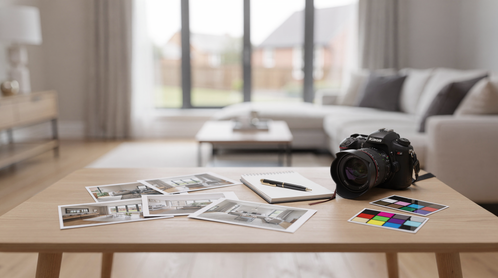
When I scroll through a gallery of listing images, I’m not just looking at individual rooms — I’m reading the visual rhythm of the entire property. A strong editing workflow doesn’t chase glamour; it builds credibility. The aim is to make every frame feel clean, bright, and coherent, so the space reads as believable from the entryway to the back patio. That sense of trust is what turns a casual browser into a scheduled showing.
Why the editing workflow matters
Editing in real estate is never just a finishing step — it’s an extension of how we present space. I’ve seen technically solid shoots undermined by rushed post‑production: color temperatures that wander from room to room, verticals that lean just enough to feel unsettling, and window views that look pasted‑on rather than pulled from the actual exposure. These inconsistencies chip away at the viewer’s confidence.
A repeatable workflow gives you control over the narrative. It helps you:
- Maintain consistent color and exposure across the full gallery, so the home feels like one continuous experience.
- Move faster through batch processing without sacrificing quality.
- Cut down on revision requests — agents and clients trust a gallery that looks intentional from the first image.
- Deliver files that hold up on MLS, portals, and social feeds, where lighting conditions and compression can be unforgiving.
The core principles of real estate photo editing
Before touching a single slider, I ask myself what the final image needs to communicate. The best edits honor the actual atmosphere of the room while correcting what the sensor couldn’t capture perfectly: white balance, perspective, and the balance between interior shadows and exterior light.
Keep the edit believable
A listing photo should feel like the room you’d walk into. That means resisting the pull of over‑saturation, heavy HDR halos, crushed blacks, or sky replacements that turn a modest backyard into a tropical fantasy. When the image oversells, it sets up a disconnect that can sour a showing. The edit should clarify, not fabricate.
Edit for consistency, not just beauty
A single striking image might sell a room, but a cohesive gallery sells the entire property. Matching white balance, contrast, and tonal treatment across every frame creates a deliberate, professional rhythm. I think of it like sequencing in a photo book: each spread should feel related, not like a collection of unrelated snapshots. That visual continuity helps buyers move through the space in their mind.
The ideal real estate photography editing workflow
Below is a sequence I’ve refined over hundreds of shoots — from sun‑drenched living rooms to dim stairwells and lobby spaces. It follows the same broad pattern most experienced editors use: ingest, cull, correct, blend, refine, and export.
| Stage | What you do | Why it matters |
|---|---|---|
| 1. Import and back up | Copy RAW files into a structured folder system and keep originals untouched. | Protects against data loss and keeps every job immediately searchable. |
| 2. Cull selects | Remove weak frames, duplicates, and misfires. | Saves editing time and strengthens the visual story by eliminating distractions. |
| 3. Apply baseline corrections | Fix lens distortion, straighten verticals, set white balance, and balance exposure. | Establishes a clean, honest starting point before any creative adjustments. |
| 4. Blend bracketed exposures | Merge HDR or manually blend frames where needed. | Recovers window detail and shadow texture without introducing artificial halos. |
| 5. Fine‑tune tone and color | Adjust contrast, highlights, shadows, and saturation with a light hand. | Keeps spaces looking natural and inviting, not processed. |
| 6. Retouch distractions | Remove cords, dust spots, small clutter, and minor blemishes. | Clears visual noise so the architecture and flow take center stage. |
| 7. Export for delivery | Save in the correct size, format, and color space for the target platform. | Ensures images display accurately on MLS, mobile, and print. |
Step 1: Import, back up, and organize
I start every job by building a folder structure that makes sense six months later. A dated job folder with room‑based subfolders is far easier to revisit than a pile of files named DSC_0001. This small upfront discipline saves hours when an agent requests a specific angle or a reshoot.
A simple structure might look like this:
2026-10-07_123-Main-StRAWSelectsEditsExportsArchived
What to check at import
- Confirm every card copied completely — I never format a card until I’ve verified the backup.
- Create a second copy of the RAW files before any edits are applied.
- Keep bracketed sequences together; separating them now creates headaches during blending.
- Rename files if your workflow or client requires searchable naming conventions.
Step 2: Cull aggressively
Culling is where speed is won or lost. A typical real estate set contains near‑duplicates, test frames, crooked shots, and frames ruined by a sudden curtain flutter or a reflection of the tripod. I treat culling as the first editorial pass: every image either earns its place or gets cut.
Cull for clarity, not sentiment
Keep the frame only if it strengthens the final gallery. Reject images that are:
- Soft or blurred — no amount of sharpening can rescue a missed focus.
- Poorly framed, with awkward cut‑offs or dead space that doesn’t serve the composition.
- Duplicate views that add nothing new; one strong angle is better than three weak ones.
- Distracted by people, glowing screens, or half‑open doors that break the spatial flow.
- Missing the strongest angle of the room — sometimes the best shot is the one you didn’t take.
Efficient culling rule
When two images are nearly identical, I keep the one with:
- Straighter verticals — leaning walls in a kitchen or bath immediately feel unprofessional.
- Cleaner window detail, where the exterior is readable without blown highlights.
- Stronger composition that leads the eye naturally through the space.
- Less visual clutter, even if it means a slightly tighter crop.
- More even exposure across the room, avoiding deep, muddy shadows in corners.
Step 3: Apply baseline corrections first
This is the foundation of the entire edit. I’ve learned the hard way that trying to finesse local adjustments before fixing lens distortion or white balance is like painting over a crooked canvas. Get the structure right, and everything else falls into place.
The four corrections to do first
- Lens distortion correction: Straightens bowed walls and corrects barrel or pincushion effects that make rooms feel warped.
- Vertical alignment: Keeps cabinets, doorframes, and window edges perfectly upright — this is non‑negotiable in architectural photography.
- White balance: Neutralizes color casts so whites read as white, preserving the true palette of finishes and paint.
- Exposure balance: Brings the overall luminance close to a natural viewing level, revealing detail without blowing out highlights.
Practical note
Don’t chase a “finished” look with local brushes before the fundamentals are locked. If verticals are off or the white balance is skewed, every subsequent adjustment becomes harder to judge. Fix the skeleton first, then add the skin.
Step 4: Handle bracketed exposures carefully
Many interior listings rely on bracketed frames to hold detail in windows while keeping shadow areas open. The art is in merging those brackets so seamlessly that the viewer never suspects multiple exposures were used. Overcooked HDR with halos around furniture or glowing edges around windows screams “edited” and erodes trust.
When to merge exposures
Use a merge or manual blend when:
- The window is completely blown out in the base exposure, losing the view or exterior context.
- The room is too dark to read spatial depth without extra shadow detail.
- You need a balanced result that feels like what the eye naturally perceives — neither flat nor artificially dramatic.
Watch for movement artifacts
Motion is the enemy of clean brackets. Curtains shifting in a breeze, ceiling fans spinning, tree branches swaying outside the window, or even a person walking through a distant doorway can create ghosting. I always check for these artifacts at 100% zoom and use stronger deghosting or manual cleanup when needed. A single misaligned leaf can distract from an otherwise flawless merge.
Step 5: Refine color and tone
Once the structure is corrected, I shape the image so it feels bright and clean without losing its sense of place. Real estate editing rewards a restrained touch: lift shadows enough to reveal texture, protect highlights near windows, and keep colors true to the materials.
A useful tonal order
- Set white balance first — it’s the anchor for every color decision that follows.
- Adjust overall exposure next, aiming for a natural luminance that matches the room’s actual light.
- Recover highlights, especially around windows and light fixtures, to preserve detail.
- Lift shadows only enough to reveal interior depth; crushed blacks hide spatial cues.
- Add contrast sparingly so the image doesn’t look flat, but avoid heavy clarity sliders that create harsh edges.
- Saturate carefully — wood tones, greenery, and painted walls should look authentic, not candy‑colored.
Common color problems to fix
- Yellow tungsten cast in living rooms that makes walls look dingy.
- Green tint from reflected lawns or adjacent foliage bleeding into interior whites.
- Mixed‑light color shifts between rooms — a warm kitchen next to a cool hallway breaks the gallery flow.
- Overly warm exteriors at sunset that turn a beige facade orange; a slight cooling can restore believability.
Step 6: Retouch distractions without overdoing it
Good retouching removes what interrupts the illusion of order: sensor dust, stray cords, small wall marks, trash bins, and temporary clutter. It should never erase the character of the property or alter permanent features. I think of it as tidying up, not remodeling.
Retouching priorities
- Sensor spots and dust — these are especially visible against light walls and skies.
- Cords, small trash items, or visible tools left behind during staging.
- Minor wall blemishes that catch the eye but don’t reflect the home’s condition.
- Distracting reflections in mirrors or glass that pull attention away from the space.
- Personal items that weaken the listing’s presentation, like family photos or branded products.
Do not cross the line
Avoid altering permanent architectural features — removing a wall outlet, changing the color of cabinetry, or erasing a structural column misrepresents the home. In real estate, visual integrity is as important as visual appeal. The goal is to present the property honestly, just at its best.
Step 7: Crop and straighten with intention
Cropping isn’t just about trimming edges; it’s a compositional tool that can strengthen or weaken the spatial story. A tighter crop might improve balance, but it should never sacrifice the context that helps a buyer understand the room’s proportions. I often leave a bit of breathing room around architectural features to let the space feel open.
Use crop decisions to solve real problems
Crop to:
- Remove dead space that doesn’t contribute to the composition — an empty corner or a sliver of ceiling.
- Center the room’s visual weight, especially in symmetrical spaces like formal dining rooms or entryways.
- Clean edge distractions, such as a sliver of a door frame or a light switch at the very border.
- Improve flow between images in the gallery; consistent aspect ratios help the eye move smoothly from frame to frame.
Straightening checklist
- Vertical lines must feel truly vertical — a subtle lean in a kitchen cabinet or bathroom tile line is immediately noticeable.
- Horizon lines should be level in exterior shots; a tilted lawn or roofline feels unsettling.
- Cabinets, windows, and doorframes should not lean unless the perspective is intentionally dynamic — and in real estate, it rarely should be.
Step 8: Apply special treatments only when they help the listing
Not every image needs advanced enhancements. I use sky replacement, virtual staging, or window pulls sparingly and only when they support the property’s story without misleading. The best special treatments are invisible — they solve a problem without announcing themselves.
Best use cases
- A flat, blown‑out sky on an exterior hero shot that undermines curb appeal.
- An empty room that benefits from staged context to help buyers imagine scale and function.
- A window view that needs a cleaner outside exposure to match the interior’s brightness.
- Exterior grass or driveway cleanup to remove temporary distractions like a parked car or a patch of dead lawn.
Caution
Extra edits must remain subtle. The more the image diverges from the original scene, the greater the risk of client misunderstandings or compliance issues. I always keep an unaltered reference frame and disclose significant alterations when required by local guidelines.
Step 9: Export in the right format
A beautifully edited image can fall apart if exported carelessly. Different platforms demand different file sizes, dimensions, and color handling. I tailor exports to the final destination — MLS, social media, or print — because what looks crisp on a calibrated monitor can turn muddy on a listing portal.
| Delivery use | Common export choice | Notes |
|---|---|---|
| MLS / web | JPEG, sRGB, moderate compression | Keeps files lightweight and display‑safe across browsers and devices. |
| Higher‑resolution export, often TIFF or high‑quality JPEG | Preserves detail for brochures, flyers, or large‑format signage. | |
| Social media | Resized JPEG in platform‑friendly dimensions | Prioritizes fast loading and clean compression; avoid over‑sharpening. |
Export checklist
- Use sRGB unless a client specifically requests Adobe RGB or another profile.
- Check sharpness after resizing — what looks sharp at full resolution may soften when scaled down.
- Confirm the gallery loads cleanly on mobile; many buyers browse on phones first.
- Keep file names organized and consistent for quick upload and agent reference.
A fast workflow for busy shoots
When volume is high, efficiency becomes essential. I’ve developed a streamlined approach that corrects the entire set globally first, then reserves detailed attention for hero images and problem rooms. This keeps turnaround fast without sacrificing the consistency that defines a professional gallery.
Fast workflow outline
- Back up RAW files immediately — never skip this step.
- Cull obvious rejects: blinks, blurs, and badly framed shots.
- Apply global corrections (lens profile, white balance, exposure) to all selects in a batch.
- Merge brackets or blend exposures only where necessary; not every room needs HDR.
- Retouch the most visible distractions — cords, dust, small clutter — with a quick pass.
- Export using job‑specific presets that match the delivery platform.
Common mistakes that weaken real estate edits
These are the issues I see most often when reviewing galleries — problems that chip away at professionalism even when the photography is solid.
- Over‑brightening interiors until walls look blown out and texture disappears.
- Leaving verticals slightly off, especially in kitchens and bathrooms where tile lines and cabinet edges amplify the error.
- Over‑saturating grass, blues, or wood tones to the point of artificiality.
- Mixing warm and cool color casts from room to room, breaking the visual flow.
- Using HDR too aggressively, creating halos around furniture and glowing window frames.
- Exporting in the wrong size or color space, leading to dull or distorted images on MLS.
- Retouching so heavily that the property no longer feels believable — buyers notice when a fireplace or outlet vanishes.
A simple quality-control checklist
Before delivery, I inspect each image at full size and then scroll through the entire gallery as a set. Individual photos may look fine alone, but the sequence must feel cohesive — like a single, uninterrupted walkthrough.
Final QC checklist
- Are the verticals straight? Check every room, especially those with strong architectural lines.
- Is the white balance consistent across rooms? A warm living room next to a cool hallway is jarring.
- Are windows readable without looking fake? The view should integrate naturally with the interior light.
- Are shadows lifted enough to show detail without flattening the space?
- Are distractions removed cleanly? Zoom in to catch sensor spots and stray reflections.
- Does the whole gallery feel cohesive? The color and tonal treatment should match from the first frame to the last.
- Do exported files meet the platform’s requirements? Check dimensions, file size, and color profile.
Choosing between manual editing and AI-assisted workflows
Many modern workflows now blend manual control with AI tools for repetitive tasks like culling, sky cleanup, decluttering, or virtual staging. The most effective setup I’ve found is hybrid: keep the technical foundation — perspective, white balance, exposure blending — under your direct control, and let automation handle the grunt work.
Use automation for
- Culling large shoots — AI can quickly flag blurry or poorly framed images.
- Basic object removal, such as power cords or small debris.
- Sky cleanup or replacement when the original is flat and featureless.
- Batch enhancements that apply consistent tone curves across dozens of images.
- Dusk or twilight conversions that require precise color shifts.
Keep manual control for
- Perspective correction — automated tools often misjudge verticals in complex spaces.
- White balance judgment, especially in mixed‑light interiors where a single click can skew the entire mood.
- Window balancing to ensure the exterior exposure feels integrated, not pasted.
- Final color decisions that reflect the true materials and finishes.
- Client‑specific style preferences that require a nuanced, human eye.
FAQ
How long should a real estate editing workflow take?
A small listing can be edited quickly once your preset and culling system are stable, but the exact time depends on the number of rooms, the amount of bracket blending, and the level of retouching required. I typically budget more time for properties with large windows, mixed lighting, or intricate architectural details — those demand a slower, more deliberate hand.
Should real estate photos look heavily edited?
No. The best real estate edits look clean and polished, not dramatic. The goal is to improve clarity and consistency while keeping the home believable. When an image feels overworked, it raises doubts about what the property actually looks like.
Is HDR necessary for real estate photography?
Not always, but it is useful when interior windows and room shadows cannot be balanced in a single frame. The key is to blend naturally and avoid obvious HDR artifacts. I often prefer manual blending for hero shots where subtlety matters most.
What is the most important edit in real estate photography?
White balance and vertical correction are usually the most important starting points because they have the biggest effect on realism and professionalism. If these two are right, the image already feels grounded and trustworthy.
What file format is best for MLS delivery?
JPEG in sRGB is commonly used for web and MLS delivery, with platform‑specific size and quality settings adjusted to match the required upload limits. Always check the MLS guidelines — some have strict dimension or file‑size caps.
Conclusion
A good real estate photography editing workflow is built on consistency: organize the files, cull hard, correct the fundamentals first, blend carefully, retouch lightly, and export with the final platform in mind. When every step supports clarity and realism, the images do more than look polished — they help the property present itself honestly and make the listing easier to trust. That trust is what moves a buyer from scrolling to walking through the front door.