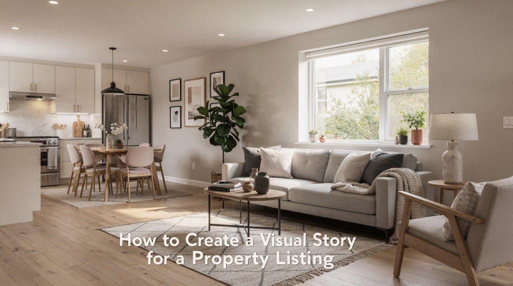
A listing that truly works doesn’t just document square footage—it choreographs a visual experience. When I scroll through a gallery, I’m not looking for one perfect hero shot; I’m looking for a narrative arc that guides me from the street to the morning light in the kitchen, from the entryway’s promise to the bedroom’s quiet retreat. The best property stories feel inevitable: every frame earns its place, and together they reveal not just what the home looks like, but how it feels to inhabit. The goal is a sequence of images that tells a believable, emotionally coherent story about how the property lives.
Why visual storytelling matters in real estate
Buyers rarely remember a listing because of a single striking image. What lingers is the atmosphere the gallery created—calm, spacious, bright, cozy, modern, or refined. That emotional residue is the product of a consistent visual story, shaped by composition, lighting, room order, and editing choices. When these elements work together, they don’t just show a house; they invite someone to imagine a life inside it.
A well-told visual story also builds trust. If the photography presents the property with a clear sense of flow and honest spatial relationships, buyers can mentally walk through the home without friction. They’re less likely to feel misled during a physical visit, which means fewer mismatched expectations and a stronger presentation overall. For agents, this translates into more qualified inquiries and a reputation for listings that feel curated rather than catalogued.
What a visual story actually is
A visual story is the narrative that emerges from the order and style of your images. Instead of treating each room as a standalone snapshot, you connect them into a sequence that answers three core questions:
- What kind of home is this?
- Who is it for?
- What does it feel like to live here?
The most compelling property stories are usually anchored in a single, simple idea: lifestyle. A kitchen can suggest family breakfasts, a home office can imply focused work, and a terrace can evoke evening wind-downs. These cues help the buyer see possibility rather than just floor plans. In visual terms, you’re not just documenting architecture; you’re curating a series of moments that, together, form a coherent mood—much like a photo essay or a short film.
Step 1: Define the property’s core message
Before you pick up a camera, decide what the listing is really selling. Not every property deserves the same visual treatment. A downtown condo, a family house, and a luxury waterfront home each demand a different emphasis—their stories are built from different materials.
Ask these questions:
- What is the main strength of the property?
- What buyer type is most likely to respond to it?
- What emotion should the images create?
- Which features should lead the story, and which should stay in the background?
For example:
- A small apartment may need a story about efficiency, light, and smart use of space—think of it as a study in verticality and negative space.
- A suburban home may need a story about comfort, flow, and family life—where the kitchen island becomes a gathering point and the backyard reads as an extension of the living area.
- A high-end property may need a story about restraint, detail, and atmosphere—where the grain of marble and the fall of natural light do the heavy lifting.
This initial clarity acts as your visual thesis. Every subsequent decision—from which lens to use to how you stage a corner—should refer back to it.
Step 2: Build the story around a clear image sequence
The order of the images matters as much as the images themselves. A coherent sequence makes the listing feel like a guided visit, not a random folder of rooms. I often think of it as a walk-through where the viewer’s eye is led from one discovery to the next, with each frame answering a question the previous one raised.
A useful structure is:
- Exterior or arrival shot
- Entryway or foyer
- Main living space
- Kitchen and dining area
- Primary bedroom
- Secondary bedrooms or flexible spaces
- Bathrooms
- Outdoor areas
- Detail or lifestyle images
- Closing image with the strongest emotional payoff
That sequence mirrors how a buyer experiences a home: approach, enter, explore, settle in, and imagine life there. If the property has a standout feature—a view, a courtyard, a hearth—place it where it strengthens the story rather than where it simply fits the floor plan. For instance, a dramatic living room with floor-to-ceiling windows might appear earlier to establish the home’s character, even if it’s not the first room you’d physically enter.
Step 3: Use composition to guide attention
Composition is how you arrange what the viewer sees. In property photography, composition should make the space feel readable, balanced, and easy to move through visually. It’s the difference between a snapshot that merely records and an image that directs the eye with intention.
Key composition habits:
- Keep vertical lines straight so rooms feel stable and professional. Converging verticals can make a space feel smaller or structurally uncertain.
- Use corners and doorways to create depth. Shooting from a corner often reveals more of the room’s geometry and invites the viewer in.
- Include enough foreground to show scale, but not so much that the room feels cramped. A sliver of a sofa arm or a piece of a rug can anchor the composition without dominating it.
- Avoid cutting important furniture or architectural details in awkward places. A chopped-off chandelier or a bisected window disrupts the visual flow.
- Use leading lines—hallways, countertops, sightlines through open doors—to pull the viewer into the frame. These lines act as visual pathways that guide attention toward the room’s focal point.
A common mistake is trying to show everything at once. That usually creates visual noise. A stronger image chooses a primary subject and gives it room to breathe. Sometimes the most powerful composition is the one that leaves something out, letting the viewer’s imagination fill the rest.
Step 4: Let light set the mood
Lighting is one of the fastest ways to define a property’s personality. Natural light often works best for a warm, believable presentation, but the right approach depends on the room and the story you want to tell. I’ve learned to schedule shoots around the sun’s path, especially for rooms with large windows, because the quality of light can make textured walls look sculptural or flat, and can turn an ordinary corner into a luminous retreat.
Use light intentionally:
- Bright, even daylight can make a home feel open and fresh—ideal for kitchens and living areas where energy matters.
- Soft side light can emphasize texture and depth, bringing out the grain of wood or the weave of a rug.
- Evening or twilight can add atmosphere and elevate a premium listing. That blue-hour glow outside combined with warm interior lamps creates a sense of sanctuary.
- Mixed light should be controlled carefully to avoid color conflicts and distraction. When daylight and tungsten clash in the same frame, the result feels unsettled rather than intentional.
The main rule is simple: the lighting should support the story, not compete with it. A bright kitchen with morning light suggests energy and routine. A dim, warmly lit lounge suggests quiet and comfort. Both can work, but each should match the property’s identity. Pay attention to color temperature as well—cooler light can feel modern and crisp, while warmer tones invite relaxation.
Step 5: Stage the scene without making it feel fake
Staging is not about stuffing rooms with decor. It is about removing friction and adding just enough context for the space to feel lived-in and intentional. The best staging often goes unnoticed; it simply makes the room look like the best version of itself.
Good staging usually includes:
- Clear surfaces that let the architecture breathe
- Neutral but warm styling that doesn’t scream a particular decade or trend
- A few well-placed objects with purpose—a book on a side table, a ceramic bowl on a shelf
- Fresh flowers, books, or textiles where appropriate, adding organic texture
- A balanced sense of order and warmth, so the space feels inviting but not cluttered
Avoid props that feel generic or overly staged. A bowl of fruit, a folded throw, or a coffee tray can work if it fits the home’s character. Random decor items copied from a template usually weaken the visual story because they lack authenticity. I once shot a condo where the agent had placed a single branch of eucalyptus in a glass vase on the kitchen island. That one organic element softened the stone countertop and gave the whole room a sense of life without clutter. It’s those small, intentional choices that elevate a scene from staged to lived-in.
Staging checklist
- Remove personal clutter—family photos, idiosyncratic collections, anything that distracts from the space itself.
- Hide cables, cleaning tools, and bins. These are visual static that pull the eye away from the room’s strengths.
- Straighten rugs, bedding, and cushions. Small misalignments can make a room feel careless.
- Open blinds and curtains fully unless mood requires otherwise. Natural light is almost always an asset.
- Replace overly bold decor with simpler accents. A loud piece of art can dominate a room and narrow the buyer’s imagination.
- Check mirrors and reflective surfaces for distractions—your own reflection, a tripod, or a messy corner can ruin an otherwise clean shot.
Step 6: Photograph details that support the larger narrative
Detail shots should not exist just because they look pretty. They should reinforce the property’s identity. A stone countertop, a brass handle, a built-in shelf, or a garden gate can all add texture to the story when chosen carefully. Think of them as punctuation marks in the visual essay—they emphasize a point, but they don’t replace the full sentences.
Useful detail categories:
- Materials and finishes—the veining in marble, the patina of hardwood, the texture of plaster
- Architectural features—molding, archways, stair railings, built-in niches
- Storage solutions—a well-organized walk-in closet or a clever mudroom bench
- View or outdoor connection—a window frame that captures a sliver of garden, a balcony railing with a cityscape beyond
- Lifestyle cues—a reading corner with a lamp and a throw, a breakfast nook with morning light
The key is restraint. If every photo becomes a close-up, the listing loses orientation. Use details as accents, not replacements for the full-room story. A close-up of a textured wool throw on a reading chair can evoke warmth and tactile comfort, but only if the wider shot has already established the room’s layout. Details work best when they answer the question, “What would it feel like to touch this surface, to sit in this light?”
Step 7: Match the story to the buyer’s likely intent
A visual story works best when it reflects what buyers are already trying to imagine. A remote worker wants to see a practical office setup. A growing family wants flow, storage, and usable common areas. A design-conscious buyer wants finish quality and spatial balance. When you align the visual narrative with these unspoken needs, the listing feels almost telepathic—it shows them what they were already hoping to find.
Here is a practical way to align the presentation:
| Buyer priority | Visual focus | Common mistake |
|---|---|---|
| Family living | Flow, storage, shared spaces—show how life moves between kitchen, dining, and living areas | Overediting into a magazine look that strips away warmth and approachability |
| First-time buyer | Efficiency, light, move-in readiness—emphasize turnkey condition and smart use of square footage | Ignoring room function; every space should clearly communicate its purpose |
| Luxury buyer | Atmosphere, materials, privacy—highlight craftsmanship, natural light, and the sense of retreat | Showing too many wide shots with no detail; luxury lives in the nuances |
| Remote worker | Office space, quiet zones, Wi-Fi-ready setup—demonstrate a dedicated, well-lit work area | Treating the office as an afterthought, or photographing it as a generic bedroom |
Step 8: Edit for consistency, not drama
Editing should make the property look clean, natural, and coherent. It should not create a false version of the home. Buyers respond better when the images feel polished but believable—when the light in the living room feels like it could exist on a Tuesday afternoon, not just in a retoucher’s imagination.
Keep editing focused on:
- Straightening perspective—correct verticals and horizontals so rooms feel architecturally sound
- Balancing exposure—avoid blown-out windows or murky shadows that hide information
- Correcting color casts—mixed lighting can introduce green or magenta tints that undermine neutrality
- Removing minor distractions—a stray cord, a reflection, a dust bunny
- Matching tone across the gallery—the kitchen and the bedroom should feel like they belong to the same home, under the same sky
Avoid excessive contrast, unnatural sky replacement, or over-saturated color that makes the home feel less trustworthy. Consistency across the full set matters more than a dramatic hero image that looks disconnected from the rest. I’ve seen listings where the kitchen looks cool and crisp while the living room glows with golden-hour warmth—that disconnect breaks the spell. The viewer should feel they’re in the same home, under the same sky.
A practical room-by-room storytelling approach
Each room plays a specific role in the visual narrative. Treat them as chapters, each with its own mood and function, but all contributing to the same overarching story.
Exterior
The exterior should establish first impression and context. Show the home’s identity from the street, then move closer if needed to highlight entrance details, landscaping, or architecture. The arrival shot sets the tone—whether it’s a manicured front yard or a sleek urban facade, it tells the viewer what kind of story they’re about to enter.
Entryway
The entry should feel like a transition from the outside world into the home’s atmosphere. Keep it clean, uncluttered, and welcoming. A well-composed entry shot often uses the doorframe as a natural frame, drawing the eye inward. Even a small foyer can convey a sense of arrival if you capture the light falling on a console table or the glimpse of the next room beyond.
Living room
This is often the emotional center of the listing. Show scale, light, and seating arrangement so the room feels usable, not just decorative. I like to shoot from a corner that reveals the relationship between seating, windows, and any focal point like a fireplace. The composition should suggest conversation and comfort, not just furniture placement.
Kitchen
Present the kitchen as a place of function and rhythm. Countertops, appliances, and circulation paths matter more than random styling objects. A clean, well-lit kitchen with clear sightlines to the dining or living area tells a story of connectivity. Pay attention to the island—it’s often the hub, so give it space in the frame.
Bedrooms
Bedrooms should emphasize calm, proportion, and privacy. Avoid angles that make the room feel smaller than it is unless the goal is honesty about compact dimensions. A shot from a low corner can sometimes make a bedroom feel more expansive, while a view that includes a window with soft curtains adds a layer of tranquility.
Bathrooms
Bathrooms need clarity and cleanliness above all. Focus on finishes, layout, and light. Mirrors can be tricky—use them to reflect a clean wall or a window, not clutter. A well-lit vanity with gleaming fixtures can become a quiet highlight in the story.
Outdoor areas
Outdoor spaces should show how the buyer might use them: dining, relaxing, gardening, or entertaining. Capture the transition from indoors to outdoors, and if possible, include a glimpse of the interior through a door or window to reinforce the flow. Evening shots with string lights or a fire pit can add a layer of atmosphere that daytime photos miss.
Typical mistakes that weaken the story
- Photographing rooms in a random order—this disorients the viewer and breaks the narrative thread.
- Using different visual styles for different images—one room warm, another cool, one heavily stylized, another flat—creates a disjointed experience.
- Overstaging with props that feel generic—a bowl of plastic fruit or a vase of fake flowers can make the whole listing feel inauthentic.
- Ignoring how one room leads to the next—transitional spaces like hallways and doorways are connective tissue; omitting them can make the home feel fragmented.
- Shooting without a clear buyer profile—the story becomes muddled when you try to appeal to everyone at once.
- Overediting to the point that the property looks unrealistic—buyers notice when a room seems to defy physics, and trust erodes.
- Leaving out transitional spaces that help the home feel connected—a narrow hallway or a staircase can be a visual bridge that maintains flow.
These mistakes make a listing feel like a collection of isolated pictures instead of one coherent experience. The fix is almost always to step back and ask: what story am I telling, and does each image serve it?
Step-by-step workflow for creating a visual story
- Walk through the property before shooting. Note the light at different times, the natural sightlines, and any quirks that could become visual assets.
- Identify the strongest feature and the main buyer appeal. This becomes the narrative anchor.
- Decide the image sequence before setting up the camera. Sketch a mental storyboard—where does the journey start, and where does it end?
- Stage the key rooms with a consistent tone. Remove distractions, add subtle warmth, and ensure each room supports the overall mood.
- Shoot wide, medium, and detail frames in a planned order. Wide shots establish context, mediums show relationships, details add texture.
- Review the set for flow, not just individual quality. Scroll through the images as a buyer would and feel the rhythm.
- Edit for consistency across the whole gallery. Match white balance, exposure, and crop style so the set feels unified.
- Check that the final sequence supports the desired emotional arc. The opening should intrigue, the middle should inform, and the closing should leave a lasting impression.
Quick checklist before publishing the listing
- Does the first image make sense as the opening to the story? It should set the tone and invite further exploration.
- Does the sequence move naturally through the home? A stranger should be able to mentally navigate the floor plan.
- Do the images feel visually consistent? Color, light, and composition should share a common language.
- Are the property’s strongest features clearly shown? If the view or the kitchen is the star, it should have its moment in the spotlight.
- Are there any distracting objects, reflections, or color issues? Scan every frame for visual noise that pulls focus.
- Does the gallery help the buyer imagine daily life in the space? The ultimate test is whether someone can picture their own morning coffee or evening unwind in these rooms.
Conclusion
A property listing becomes more persuasive when the photography does more than document rooms. The strongest visual stories combine thoughtful sequencing, clear composition, controlled light, and subtle staging to show not only what the property looks like, but what it feels like to live there. When the images work together as a narrative, the listing becomes easier to understand, easier to remember, and more likely to connect with the right buyer. It’s the difference between a catalog of spaces and an invitation to a new chapter of life.
FAQ
How many photos should a property listing have?
There is no fixed number, but the gallery should be complete enough to tell the story without repeating the same view. Quality and sequence matter more than volume. I typically aim for enough images to cover every key space and a few detail accents—usually between 20 and 35 frames for a standard home, but a smaller condo might need only 15 well-chosen shots.
Should a listing always start with the exterior?
Usually yes, unless the property’s strongest selling point is inside, such as a dramatic view, exceptional kitchen, or unique interior architecture. The exterior grounds the story in context, but if the interior is the undeniable hero, lead with it and then pull back to show the approach later. The rule is: start with what makes the heart beat faster.
Is staging necessary for every home?
Not always, but some level of preparation is. Even minimal staging—cleaning, decluttering, and a few intentional touches—can improve how the story reads. An empty room can feel cold and ambiguous; a thoughtfully arranged one suggests possibility. The goal is to remove barriers to imagination, not to decorate.
What matters more: lighting or composition?
Both matter, but composition gives the image structure while lighting gives it mood. A strong listing needs both working together. You can have beautifully soft light, but if the composition is chaotic, the image fails. Conversely, a perfectly composed room with harsh, unflattering light will feel uninviting. They are two sides of the same coin.
How do you make a small property feel more appealing?
Use a clear sequence, show scale honestly, emphasize light and function, and avoid clutter. Small spaces often benefit from disciplined editing and careful angle selection. Shooting from a corner with a wide lens can expand the sense of volume, but be careful not to distort proportions. Highlight smart storage, vertical space, and any connection to the outdoors—a small balcony or a well-framed window can make a compact home feel larger than its footprint.