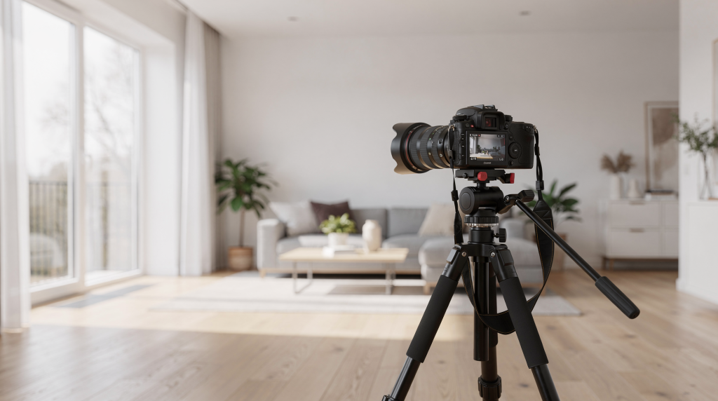
Interior real estate photography is a quiet negotiation between light, geometry, and expectation. The settings you choose don’t just determine exposure—they shape how a viewer feels about a room before they ever step inside. Consistency is the foundation: sharpness from foreground to back wall, detail held in both sunlit windows and shadowed corners, files that edit cleanly without forcing corrections that degrade the image.
Start in manual mode, set your aperture between f/7.1 and f/9, keep ISO as low as practical—ideally 100 to 400—and mount the camera on a tripod so slower shutter speeds won’t introduce blur. Shoot RAW, and bracket exposures whenever the brightness gap between windows and interior shadows is too wide for a single frame to hold.
Why interior camera settings matter
A photograph of a room isn’t a neutral document; it’s a visual argument about how that space feels to inhabit. When settings wander from frame to frame, the narrative fractures. A sun-drenched living room that looks airy and open in one shot shouldn’t feel cramped and muddy in the next just because the camera metered differently. The real challenge is dynamic range: windows can be four, five, even six stops brighter than the darkest corner of the same room. Without a deliberate, tripod-based approach—controlled aperture, low ISO, and often exposure bracketing—you either sacrifice the view outside or bury the interior in noise and shadow. Good settings don’t just make a room look bright; they make it look true.
The best starting settings
Use this baseline for most rooms. It’s not a rigid formula but a reliable point of departure—one that respects the geometry of the space and the quality of light you’re working with.
| Setting | Recommended starting point | Why it works |
|---|---|---|
| Mode | Manual | Locks exposure consistency across every frame, so the visual rhythm of the listing stays intact. |
| Aperture | f/7.1 to f/9 | Delivers enough depth of field to keep the entire room legible without pushing the lens into diffraction softness. |
| ISO | 100 to 400 | Preserves fine texture—paint, wood grain, fabric—and keeps noise out of shadow areas where it’s most visible. |
| Shutter speed | Whatever the exposure requires | On a tripod, slow speeds are safe; the priority is a clean exposure, not a fast one. |
| White balance | Custom or fixed Kelvin | Prevents color shifts between rooms, so the property feels cohesive rather than patched together. |
| File format | RAW | Gives generous latitude for color and exposure adjustments without degrading the file. |
| Support | Tripod | Eliminates motion blur at the slow shutter speeds typical indoors, and enforces deliberate composition. |
When these settings become second nature, the camera stops being a technical obstacle and starts acting as an extension of your eye. The room’s proportions, the fall of light across a floor, the texture of a stone countertop—all of it reads clearly, without the distractions of noise or inconsistent color.
Aperture: the most important setting for room sharpness
In interior work, aperture is less about creative blur and more about spatial legibility. A range of f/7.1 to f/9 keeps the foreground and background in simultaneous focus, which matters when you want a viewer to mentally walk through the space. At these apertures, a rug two feet from the lens and a window fifteen feet away both hold detail. You avoid the diffraction that can creep in beyond f/11, where overall crispness starts to soften even as depth of field increases.
When to go wider
Apertures of f/4 or below have their place, but they’re for visual punctuation, not full-room descriptions. A detail shot of a hand-carved mantel, a close-up of textured wallpaper, or a vignette of styled shelving can benefit from shallow depth of field. It pulls the eye to a specific surface or object, creating a moment of intimacy. But for the wide establishing shot that tells a buyer how the living room actually lives, a wide aperture leaves the back of the room unreadable—and that’s information lost.
When to stop down more
In especially deep spaces—a long gallery hallway, a lobby that stretches toward a distant reception desk—some photographers push to f/10 or f/11. It’s a trade-off: you gain a bit more depth at the far end, but you may lose the finest micro-contrast that makes surfaces feel tactile. For the majority of residential rooms, f/8 is the sweet spot. It balances depth of field with the lens’s optical performance, giving you a file that feels sharp without looking artificially hardened.
ISO: keep it low
Low ISO is the simplest way to honor the materiality of a space. When you photograph a room, you’re recording surfaces: matte wall paint, oiled wood floors, woven textiles, polished stone. Noise eats into that texture, replacing the subtle grain of linen or the smoothness of plaster with a digital grit that flattens the tactile experience. Most interior guides converge on ISO 100–400 for good reason—within that window, modern sensors render clean, malleable files.
Practical rule
- Begin at ISO 100 whenever the tripod is locked down and the light allows it.
- Move to ISO 200 or 400 only when the shutter speed becomes impractically long for the scene—say, beyond several seconds—or when you need a touch more flexibility for an exposure bracket.
- Resist the temptation to raise ISO just to avoid a two-second exposure. A stable camera doesn’t care about time; it cares about stillness.
Noise is most aggressive in the shadows: dark-painted accent walls, the corner behind a sofa, the underside of cabinetry. Those are exactly the areas where buyers look for signs of wear or quality. Clean files let those details speak without interference.
Shutter speed: slower is normal indoors
Interior photography is one of the few disciplines where a one-second exposure can be utterly routine. Light levels indoors are often a fraction of what they are outside, and the tripod liberates you from the tyranny of hand-holdable speeds. Shutter speeds from 1/15 second to several seconds are common, and in dimmer rooms—a windowless powder room, a moody library—you might comfortably work in the multi-second range.
What matters here
- A slow shutter is harmless when the camera is absolutely still.
- The same speed handheld will blur every detail, no matter how steady your grip.
- Use a remote release, a 2-second self-timer, or the camera’s built-in delay to kill vibration from mirror slap or shutter press.
Quick guide
- Bright room with generous windows: roughly 1/60 to 1/125 if the light is strong and direct.
- Typical interior on a tripod: 1/15 to 1 second, depending on window size and artificial light.
- Dim room with little natural light: can easily require multiple seconds—meter carefully and check the histogram.
White balance: avoid color surprises
Color is emotional. A room bathed in consistent, believable color feels intentional; a room where the walls shift from warm beige to cool gray between frames feels unsettled. Auto white balance is the enemy of that cohesion because it reevaluates the scene with every shot, reacting to the mix of daylight, tungsten, and shadow. The result is a gallery that looks like it was photographed by three different people.
A more reliable path: shoot RAW, set a fixed white balance or dial in a custom Kelvin value, and refine in post-production. Many interior photographers work around 4500K to 5500K for spaces dominated by daylight or mixed sources. Warmer artificial light may call for a lower Kelvin setting; a room flooded with cool north light might need a slightly higher value. The goal isn’t clinical neutrality—it’s consistency that lets the property’s own palette come through.
Why this matters
When a potential buyer scrolls through a listing, they’re subconsciously checking for trustworthiness. If the wall color drifts from room to room, the whole presentation feels careless. Consistent white balance signals that someone paid attention—to the light, to the space, to the details that make a house feel like a home.
Manual mode vs Aperture Priority
For serious real estate work, manual mode is the stronger default because it enforces exposure consistency across an entire shoot. When you move from a bright kitchen to a darker hallway, manual mode forces you to make deliberate decisions rather than letting the meter chase the light. That consistency is what makes a set of images read as one continuous visual story, not a collection of disconnected snapshots.
Some photographers use Aperture Priority with Auto ISO as a faster workflow, particularly for simpler properties or when they’re still building confidence. It can work, but it cedes control. In a room with mixed light sources—a chandelier, under-cabinet LEDs, daylight spilling through sheer curtains—the meter can be fooled, and exposure can drift.
Best practice
Reach for manual mode when:
- You want uniform exposure across every room in the listing.
- You’re bracketing exposures for HDR or manual blending.
- The property mixes daylight, tungsten, and accent lighting.
- You need predictable, repeatable files that edit efficiently.
Exposure bracketing: essential for tricky lighting
A single exposure often can’t honor both the view through a window and the texture of a shadowed interior wall. Bracketing solves this by capturing a sequence of frames at different exposures, then blending them into one image that holds detail across the full tonal range. It’s not a special effect—it’s a practical acknowledgment of how our eyes actually see a space, constantly adjusting as we scan from bright to dark.
A typical bracket: 3 to 5 exposures, spaced at 2 EV intervals. For example: -4, -2, 0, +2, +4. This gives you a deep well of data to pull from in post-production, whether you’re using HDR software or manual luminosity masking.
When to bracket
- Rooms with large windows that dominate the frame.
- Interiors facing direct sun, where the light outside is dramatically brighter.
- Spaces with dark furniture, deep wood paneling, or charcoal walls that swallow light.
- Any shot where the exterior view is a selling point and must read clearly.
When you may not need it
- Evenly lit rooms with small or frosted windows.
- Small powder rooms or closets with controlled, consistent artificial light.
- Detail shots where the tonal range is naturally compressed.
Recommended camera settings by room type
Every room has its own relationship with light, and the settings should respond to that. The table below is a field reference, not a prescription—use it to anticipate what a space will ask of you before you set up the tripod.
| Room type | Aperture | ISO | Shutter speed | Notes |
|---|---|---|---|---|
| Bright living room | f/8 | 100–200 | 1/30–1/125 | Natural light may be sufficient; watch for hot spots on glossy floors. |
| Standard bedroom | f/7.1–f/9 | 100–400 | 1/15–1/2 sec | A tripod is non-negotiable here; slow speeds are the norm. |
| Dark bathroom | f/8–f/11 | 200–400 | 1/2–2 sec | Manage reflections in mirrors and chrome; mixed light can shift color. |
| Kitchen with windows | f/8 | 100–200 | 1/15–1 sec | Bracketing often helps balance bright windows against darker cabinetry. |
| Hallway or entryway | f/8–f/9 | 200–400 | 1/2–4 sec | These transitional spaces usually need more light than you expect; meter carefully. |
A simple field workflow
A repeatable workflow removes guesswork and lets you focus on the visual story instead of the technical chatter. Here’s a sequence I rely on when walking into a new property:
- Set the camera on a tripod and level it. Vertical lines are the skeleton of architectural photography. A tilted camera makes walls converge or diverge, undermining the structural integrity of the image. Use the tripod’s bubble level or the camera’s electronic level.
- Switch to manual mode. This locks in your decisions and keeps the exposure logic consistent.
- Set aperture to f/8. It’s the center of the reliable range and works for most residential proportions.
- Set ISO to 100. Start with the cleanest possible file; raise it only if the shutter speed becomes unworkable.
- Meter the scene and choose the shutter speed that gives a balanced exposure. Don’t rely on the rear screen alone—its brightness can mislead you in a dim room.
- Check the histogram. Make sure you’re not clipping important highlights (like window details) or crushing shadow areas that hold texture.
- Adjust white balance for consistency. Dial in a Kelvin value that suits the dominant light source, and keep it for the entire shoot.
- Bracket if the windows are significantly brighter than the room. A quick three- or five-frame bracket saves you from impossible editing decisions later.
- Shoot in RAW. The extra bit depth and white balance flexibility are essential when you’re blending exposures or correcting mixed light.
- Review for straight verticals and even tonal balance. Before moving to the next room, confirm that the composition feels grounded and the light reads naturally.
Common mistakes to avoid
- Using too wide an aperture and losing sharpness across the room. A shallow depth of field can make a spacious living area feel claustrophobic because the viewer can’t see into the distance.
- Raising ISO too high and introducing noise into walls and shadows. That noise erodes the perceived quality of finishes—buyers may not know why a room feels less premium, but they’ll sense it.
- Shooting handheld in low light and getting motion blur. Even a slight softness from camera shake undermines the crisp, professional look that listings demand.
- Leaving white balance on Auto and ending up with mismatched color from room to room. The visual disconnect breaks the immersive experience of touring the property online.
- Ignoring window highlights and blowing out exterior views. That view is part of the home’s value; losing it to a white rectangle weakens the entire image.
- Forgetting to level the camera, which makes walls and door frames look distorted. Viewers may not consciously notice, but the room will feel subtly wrong.
- Changing settings randomly from room to room instead of keeping a consistent baseline. Inconsistency is the fastest way to make a listing look amateur.
A practical cheat sheet
Best default settings
- Manual mode
- f/8
- ISO 100
- Tripod
- RAW
- White balance fixed or custom
- Bracket when needed
Best mindset
Think in terms of consistency first, brightness second. A properly exposed interior should look clean, natural, and readable—not artificially bright. The goal is to make the space feel authentic and inviting, as if the viewer could step into the frame and walk through the room. That authenticity comes from settings that respect the light as it actually exists, not from pushing every shadow into mid-gray or blowing every window to pure white.
FAQ
What is the best aperture for interior real estate photography?
For most rooms, f/7.1 to f/9 is the most reliable range. It keeps the entire space sharp from foreground to background without introducing the softness that diffraction can cause at smaller apertures. Think of it as the aperture that lets the room speak clearly, without the lens adding its own interpretation.
What ISO should I use indoors?
Start at ISO 100 and stay below ISO 400 whenever possible. Low ISO preserves the fine textures that make surfaces feel real—the grain of hardwood, the nap of a rug, the smoothness of painted drywall. Noise in the shadows is particularly damaging because it can make a well-maintained home look tired or poorly finished.
Can I shoot interiors without a tripod?
You can, but you’ll be fighting the light instead of working with it. Interior photography routinely demands shutter speeds that are too slow to hand-hold without blur. A tripod isn’t just about sharpness—it also forces you to slow down, compose deliberately, and keep vertical lines true. For any space where detail and atmosphere matter, a tripod is the single most important piece of gear after the camera itself.
Should I use flash or natural light?
Both have their place, and the choice depends on the property and the visual story you want to tell. Many interior workflows rely on natural light supplemented by exposure bracketing, which preserves the ambient mood of the room. Controlled flash can be invaluable for color accuracy and consistency in challenging mixed-light situations, but it requires more gear and a careful hand to avoid a flat, overlit look. The best approach is the one that makes the space feel most like itself.
Do I need HDR for every room?
No. HDR or bracketed blending is most useful when the scene has strong contrast—particularly bright windows against darker interiors. In evenly lit rooms with small or diffused light sources, a single well-exposed RAW file often contains all the information you need. Reserve the extra workflow for the frames that truly demand it.
Should I shoot RAW or JPEG?
Shoot RAW. The flexibility it gives you in post-production—recovering highlight detail, fine-tuning white balance, lifting shadows without introducing banding—is essential for interior work. JPEGs bake in processing decisions that you can’t undo, and in real estate photography, where mixed light and high contrast are the norm, that limitation costs you quality.
Final takeaway
The best camera settings for interior real estate photography aren’t complicated: manual mode, f/8, low ISO, tripod support, RAW capture, and bracketing when contrast gets difficult. But these settings are more than a technical checklist. They’re the framework that lets you translate a three-dimensional space into a two-dimensional image that still feels spacious, honest, and inviting. When you keep those fundamentals consistent, you stop wrestling with the camera and start paying attention to what really matters—the light falling across a floor, the way a room opens up as you step inside, the quiet story a home tells when someone truly sees it.