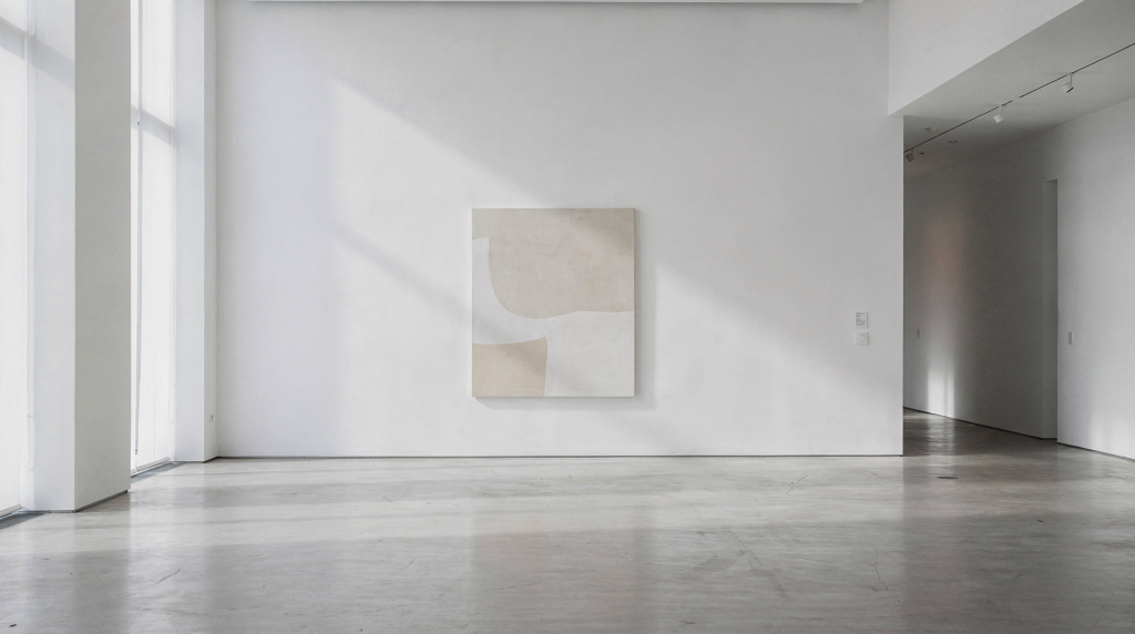
Silence and space are not gaps to be filled; they are active parts of a composition that shape how a viewer feels, reads, and remembers an image. In visual art, what is left out can be just as powerful as what is included, because absence creates rhythm, emphasis, and emotional weight. I learned this first through fine art and portraiture, then later in the quiet geometry of empty lobbies and sunlit living rooms. The principle holds across every medium: the space you leave untouched does as much work as the subject you place in the frame.
Why Silence and Space Matter
In art, “space” usually refers to the area around, between, and within forms. The important idea is that empty does not mean meaningless: negative space can define the subject, guide the eye, and create balance. Silence works the same way as a visual metaphor—when an artwork gives a viewer room to pause, the image becomes more legible and more memorable.
This is why sparse compositions often feel calm, elegant, or contemplative, while crowded ones can feel tense, noisy, or restless. The artist is not just placing objects; they are also controlling visual breathing room. In architectural photography, that breathing room might be a stretch of unadorned wall behind a sculptural staircase, or the deliberate emptiness of a foyer that lets the proportions of the room speak. When I walk into a property, I’m not just looking for what to include—I’m looking for where the silence already lives, and how to protect it in the final frame.
Positive Space vs. Negative Space
A useful way to understand silence in art is to separate positive space from negative space.
| Term | Simple meaning | What it does in an artwork |
|---|---|---|
| Positive space | The main subject or occupied area | Holds attention, carries the core message |
| Negative space | The open area around, between, or within forms | Defines edges, adds balance, creates emphasis |
Negative space is not always white, blank, or empty in a literal sense. It may contain texture, color, shadow, or detail. What makes it “negative” is its role in the composition, not its appearance. A softly lit plaster wall behind a mid-century armchair is negative space; the chair is positive. But that wall isn’t empty—it carries the grain of the plaster, the fall of light, the subtle warmth of the paint. Those qualities do real emotional work. They make the chair feel more considered, more anchored. In real estate photography, this distinction is critical. An agent might want to fill that wall with art or shelving, but sometimes the strongest visual statement comes from leaving it alone and letting the room’s architecture breathe.
Silence as a Visual Idea
Silence in visual art is the feeling created when an image avoids visual overcrowding. It can appear through:
- Large uncluttered backgrounds
- Wide margins around a subject
- Minimal detail in secondary areas
- Repeated open intervals between forms
- Soft transitions that reduce visual noise
This kind of silence gives the viewer time to absorb the work. It slows down perception. Instead of demanding attention all at once, the artwork unfolds gradually. When I photograph a living room flooded with morning light, I often pull back just enough to let the floor lead the eye toward the seating area. That strip of empty floor isn’t wasted space; it’s a visual inhale. It sets a pace. The same principle applies to a gallery wall or a portrait background—silence is a pacing tool, not a void.
What Silence Does for the Viewer
Silence and space affect perception in practical ways:
- They make the focal point easier to identify
- They reduce confusion in complex scenes
- They create emotional tone, such as calm, loneliness, dignity, or restraint
- They improve visual hierarchy by separating important elements from supporting ones
- They make an image feel more intentional and refined
A painting, photograph, or installation with good spatial control often feels “finished” not because it is packed with detail, but because every empty area has been considered. In a property shoot, that translates to a listing photo where the buyer immediately understands the room’s flow, rather than getting stuck on a cluttered corner. The silence in the frame tells them where to look and, just as importantly, where to rest.
Common Ways Artists Use Space
1. Framing a subject with emptiness
A single figure placed against a quiet background feels more exposed and more symbolic. The empty space around it acts like a stage. In interior photography, a solitary dining table centered in a bright, unadorned room takes on a sculptural presence. The emptiness elevates the object from functional furniture to a statement about form and light.
2. Creating tension through distance
When elements are separated by a wide gap, the viewer senses relationship and distance at the same time. That gap becomes part of the meaning. I’ve used this in hotel lobby shots where a lone reception desk sits far from the entrance, the stretch of polished floor between them building anticipation. The distance isn’t just physical—it’s atmospheric.
3. Balancing busy and quiet areas
Strong compositions often alternate between dense and open sections. The quiet areas prevent overload and let the busy areas land harder. A kitchen photograph might show a richly textured marble island on one side, balanced by a clean, shadowed wall on the other. The eye moves between detail and rest, never feeling overwhelmed.
4. Suggesting atmosphere
Space can imply air, light, stillness, or isolation. In this sense, silence is not a lack of content; it is a way of describing mood. A hallway with a single window at the far end, surrounded by bare walls, feels contemplative. The silence in the image isn’t about what’s missing—it’s about the quality of light and the weight of the emptiness.
5. Directing the eye
Open space works like a visual corridor. It helps the viewer move through the artwork in a controlled order rather than scanning randomly. In a real estate interior, a clear sightline from the entryway through to the living area, kept free of visual obstacles, guides the potential buyer’s gaze exactly where you want it: toward the fireplace, the view, the heart of the home.
Why Empty Space Is Never Really Empty
A common mistake is to treat negative space as leftover background. In strong art, it is planned from the start. Even when nothing obvious is placed there, the space still does work:
- It creates contrast
- It shapes silhouette
- It influences scale
- It changes emotional temperature
- It helps the main subject feel more specific
This is why the same object can feel different depending on how much space surrounds it. A chair isolated in a bright room feels calm and formal. The same chair surrounded by clutter feels practical, cramped, or anxious. I’ve seen this play out repeatedly on shoots: an agent wants to show “how much furniture fits,” but the resulting photo reads as chaotic. Pull everything back, leave generous floor space, and suddenly the room feels larger, more luxurious, more intentional. The emptiness isn’t empty—it’s communicating scale and serenity.
Silence in Different Art Forms
Painting and drawing
In painting, silence often comes from restrained composition, wide tonal fields, or areas where the eye can rest. In drawing, it may come from clean contours and strategic use of blank paper. The untouched paper isn’t an afterthought; it’s an active element that gives the line its voice.
Photography
Photography uses space in a particularly direct way because framing is fixed at the moment of capture. A photographer can create silence by leaving room around the subject, simplifying the background, or waiting for a scene to clear. When I’m shooting a property, I’ll often wait for a cloud to soften the light, or shift my tripod a few inches to eliminate a distracting outlet from the edge of the frame. Those small decisions protect the silence and let the architecture speak without visual static.
Sculpture and installation
In three-dimensional work, the “space around the object” becomes part of the piece. The viewer experiences silence by moving through and around the work, not just by looking at it. The same is true in a well-designed room: the negative space between furniture pieces is what makes the arrangement feel composed rather than crammed.
Architecture and interiors
Built spaces rely on silence constantly. Hallways, lobbies, stair landings, and sunlit rooms all use proportion, light, and emptiness to shape how people feel inside them. A room with thoughtful breathing room feels more composed than one that is visually overloaded. I’ve photographed stairwells where the only subject was the curve of the railing and the shadow it cast on a bare wall. That kind of image doesn’t just document a feature—it translates the experience of being in that space, the quiet echo of footsteps, the pause between floors.
How to Read Silence in an Artwork
Use this quick checklist when looking at a piece:
- Where does your eye land first?
- What areas feel open or quiet?
- Do the empty areas support the subject or compete with it?
- Is the composition crowded at the edges?
- Does the artwork feel calm, tense, lonely, or balanced?
- Would the image lose clarity if more elements were added?
If the answer to the last question is yes, the silence is doing important work. I apply a version of this checklist on every shoot, scanning the frame not just for what’s in it, but for how the empty zones are behaving. Sometimes the strongest edit is removing a throw pillow or shifting a chair two feet to the left—not to hide something, but to let the space between objects do its job.
How Artists Can Use Silence Better
Step 1: Identify the real subject
Decide what the artwork is actually about. If everything is equally important, the composition will feel weak. In a real estate photo, the subject might be the relationship between a window and the light it casts, not every piece of furniture in the room. Once you know what the image is about, you can build the silence around it.
Step 2: Remove one thing
Before adding more, test whether the image improves by subtracting an element. Often the composition becomes stronger when it is simplified. On location, I’ll ask myself: if I take away that side table, does the room breathe better? The answer is almost always yes.
Step 3: Protect the focal point
Leave enough room around the subject so it can breathe. Tight cropping can be powerful, but only when it is intentional. A fireplace shot cropped too close loses the sense of the room around it; pull back to include a bit of bare wall and floor, and suddenly the fireplace feels anchored in a real, livable space.
Step 4: Watch the background
A background should not compete unless competition is the point. Uneven clutter behind the subject can destroy the feeling of silence. In interior photography, this means checking for busy artwork, tangled cords, or patterned textiles that pull the eye away from the intended focal point.
Step 5: Check the edges
Edges are where many compositions fail. Too many distractions near the borders can make the image feel noisy, even if the center is simple. I habitually scan all four edges of the frame before pressing the shutter. A stray chair leg, a sliver of doorway, a bright reflection—any of these can introduce visual chatter that undermines the silence you’ve built.
Typical Mistakes
- Confusing emptiness with weakness
- Filling space just to avoid discomfort
- Cropping too tightly around the subject
- Ignoring the emotional effect of open areas
- Using silence accidentally instead of intentionally
- Treating negative space as a leftover design problem
Good spatial design is not about making things sparse for their own sake. It is about creating the right amount of visual room for the subject to speak. I’ve seen agents panic at the sight of an empty corner and rush to fill it with a plant or a basket. But often that corner was doing exactly what it needed to do: holding the composition together by offering a place for the eye to pause.
Practical Takeaway for Photographers and Visual Storytellers
For photographers, especially those working with interiors, architecture, or fine art-inspired compositions, silence and space are essential tools. A clean room, a quiet wall, a shaft of light, or a generous amount of floor visible in the frame can completely change the story. I’ve walked into properties where the agent apologized for the “empty” feel, and I’ve walked out with some of the strongest images of the year—because the emptiness wasn’t a flaw, it was the feature. The space gave the architecture room to perform.
Think of space as a form of editing. Every part of the frame that remains open helps the viewer understand what matters most. When you leave that patch of wall untouched, you’re not being lazy—you’re making a deliberate choice about where the story lives.
Quick Guide: When to Add More, When to Leave Space
| Situation | Better choice | Why |
|---|---|---|
| Subject feels lost | Add framing or contrast | Helps the subject stand out |
| Image feels cluttered | Leave more negative space | Restores clarity |
| Artwork feels emotionally flat | Adjust spacing and scale | Creates mood and tension |
| Composition needs elegance | Simplify and open it up | Space adds refinement |
| Message is complex | Use silence to slow the viewer down | Improves readability |
Conclusion
Silence and space are core elements of visual art because they shape how meaning is experienced. They define form, control attention, and give an artwork emotional depth. When used well, emptiness does not reduce the image—it strengthens it by making every visible element matter more. In the context of photographing homes, hotels, and galleries, this principle transforms a simple record shot into a visual statement. The spaces we leave open are never neutral; they are the quiet architecture of perception itself.
FAQ
What is the role of negative space in visual art?
Negative space helps define the subject, create balance, and guide the viewer’s eye through the composition. In interior photography, it’s the uncluttered wall or floor that lets the furniture and architecture read clearly.
Is silence the same as empty space in art?
No. Silence is an effect created by space, not just a blank area. It can feel calm, reflective, dramatic, or restrained. A sunlit empty room can feel full of presence; a cluttered room can feel visually deafening.
Why do minimal artworks often feel powerful?
Because they use space deliberately. With fewer elements competing for attention, the remaining forms carry more weight. The same logic applies to a well-composed real estate photo where one strong architectural feature dominates a clean frame.
Can too much empty space weaken an artwork?
Yes, if the space is accidental or disconnected from the subject. But intentional emptiness can make an artwork stronger and more expressive. The key is whether the space serves the subject or just sits there without purpose.
How can photographers use silence visually?
By simplifying backgrounds, leaving room around the subject, controlling light, and avoiding unnecessary visual clutter in the frame. In practice, this might mean moving a piece of furniture, waiting for the right light, or choosing a composition that lets the architecture breathe.