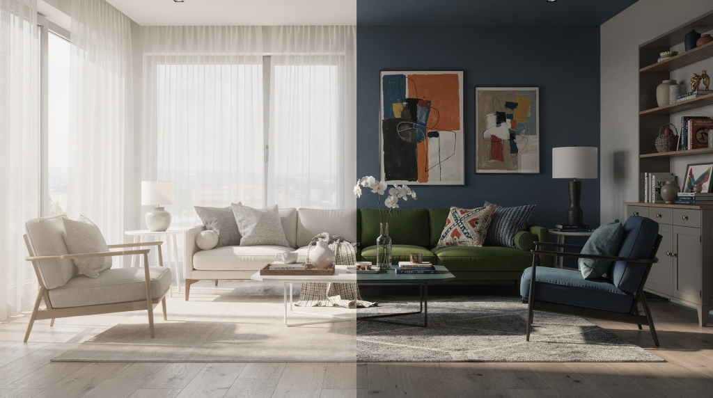
Styling does more than make a room look “finished.” It changes how a space is read, how it feels, and what story it tells. The same room can feel calm, formal, playful, or spacious depending on what is placed in it, what is removed, and where the eye is directed. As a photographer who has spent years framing everything from gallery walls to sun-drenched living rooms, I’ve seen how a single object—or its absence—can completely shift the narrative a room projects. This isn’t about decoration; it’s about visual communication.
Why styling changes perception
Interior spaces are not just seen; they are interpreted. Visual perception organizes shape, color, scale, texture, and light into meaning. That means styling is never neutral: every object either supports the story of the room or competes with it. When I walk into a space with a camera, I’m immediately reading how the light falls on a surface, where the shadows pool, and whether the arrangement of furniture pulls the eye toward a focal point or scatters it. A bare room may look larger, but also colder and less legible—like an unfinished sentence. A well-styled room can feel warmer, more useful, and easier to understand. In practical terms, styling helps viewers answer one question fast: “What is this space for, and how would I live here?” For a real estate listing, that question is everything. The styling doesn’t just decorate; it defines the room’s purpose before the viewer has to think about it.
Styling vs. decorating: the difference matters
Styling and decorating are often treated as the same thing, but they do different jobs. Decorating is personal—it reflects the occupant’s taste, history, and quirks. Styling, on the other hand, is editorial. It clarifies the function and mood of a space, removes distractions, and supports a visual narrative, often for a temporary, market-facing purpose. I’ve shot homes where the owner’s decorating was beautiful but too specific: a collection of vintage cameras on a shelf told me about the person, not the room. For a listing photo, that specificity narrows the audience. Styling steps in to broaden it, making the space feel like a possibility rather than a memoir.
| Styling | Decorating |
|---|---|
| Clarifies the function and mood of a space | Expresses personal taste |
| Removes distractions | Adds personality and detail |
| Supports a visual narrative | Reflects the occupant’s style |
| Often temporary or market-facing | Usually long-term and personal |
Home staging sources consistently describe styling as a market-facing tool that helps strangers imagine themselves in the space. Decorating, by contrast, is usually about the people who already live there. That distinction matters because the meaning of an interior changes when the audience changes. A family home, a rental listing, and a portfolio shoot all need different visual decisions. As a photographer, I adjust my lens and lighting to serve that intended meaning—whether it’s the soft, aspirational glow of a staged living room or the crisp, architectural honesty of a designer’s portfolio.
What styling actually changes in a room
1. It defines the focal point
Every room has one or more natural focal points: a fireplace, a window, a feature wall, a bed, or an architectural detail. Styling can strengthen that focal point or dilute it. Good styling uses furniture, art, and accessories to guide the eye instead of scattering attention across the room. When I’m composing a shot of a lobby or a staircase, I look for the line that leads the viewer in. A well-placed console table with a single sculptural lamp can anchor a wide-angle frame and give the eye a place to land. Without that anchor, the image feels adrift, no matter how grand the architecture.
2. It changes scale
Large rooms can feel empty and undefined without enough visual anchors. Small rooms can feel cramped when styling is too heavy. The right amount of furniture, negative space, and proportion makes the room feel more accurate to its real size. I often see agents struggle with this: a massive great room photographed with a tiny loveseat and a side table looks cavernous and uninviting, not spacious. Conversely, a compact bedroom stuffed with oversized nightstands and heavy drapes reads as claustrophobic. Styling corrects that misperception by balancing mass and void, which is exactly what the camera records.
3. It edits emotion
Color temperature, texture, symmetry, and clutter all influence how a room feels. Soft linens, natural materials, and balanced layers usually read as calm and lived-in. Hard contrasts, dense decor, and strong personal objects can make a space feel busier or more specific. From a photographic standpoint, emotion lives in the details: the way a linen throw catches sidelight, the cool shadow under a ceramic vase, the rhythm of repeated wood tones. Styling that ignores these nuances can make even a well-designed room feel flat or chaotic in photos.
4. It shifts identity
A room with family photos, collections, and strong personal objects communicates the owner’s life. Remove those cues, and the same room becomes more universal. That is why staging often includes decluttering and depersonalizing: it creates enough neutrality for a viewer to project themselves into the space. I’ve photographed the same living room before and after depersonalizing, and the difference is striking—the “after” shot feels like a space waiting for someone’s story, not already occupied by someone else’s. That openness is what sells a property, and it’s what makes a portfolio image feel timeless.
The psychology behind styled interiors
Buyers and visitors rarely analyze a room in a purely logical way. They respond emotionally first. Staging guides describe this as helping people envision themselves in the space and lowering the mental effort needed to imagine living there. That is the real power of styling: it reduces uncertainty. When a room feels orderly and intentional, the brain spends less energy decoding it. That can make the space feel larger, calmer, and more desirable. In a property context, that emotional clarity can be just as important as square footage or finishes. As a photographer, I see this in the way people linger on an image: a well-styled room invites the eye to wander without friction, while a cluttered or ambiguous one triggers a subtle tension that makes the viewer scroll past.
How styling changes the meaning of specific rooms
Living room
A sparsely furnished living room may read as unfinished or transient. Add a grounded seating arrangement, a rug that defines the zone, and a few layered details, and it becomes a place for gathering. In my shoots, I often use a rug as a visual anchor—it sets the compositional frame and tells the camera exactly where the conversation happens. Without it, sofas can look like they’re floating, and the room loses its sense of purpose.
Bedroom
A bedroom without styling can feel purely functional. Add texture, symmetry, and limited accessories, and it shifts toward rest, privacy, and retreat. I pay close attention to bedside symmetry: two lamps, two tables, a centered headboard. That balance reads as calm in a photograph, while asymmetry can feel dynamic but less restful. For a listing, calm usually wins.
Kitchen
Kitchens often gain meaning through restraint. A styled kitchen usually needs only a few intentional objects: a bowl of fruit, a cutting board, a clean counter, or one natural accent. Too many items make the space feel smaller and more task-heavy. When I shoot kitchens, I’m looking for clean horizontal planes—counters that breathe. A single wooden board with a lemon and a knife tells a story of possibility without shouting.
Entryway
This is where first impressions form. A styled entryway signals that the rest of the home has been considered. It can also establish tone: modern, welcoming, minimal, or classic. Photographically, the entry is often the first frame an agent wants, and it sets the visual language for the entire set. A well-styled console with a mirror, a lamp, and a single object can create depth and lead the eye into the next room.
Practical styling principles that work
Use less, but make each item count
One strong object is usually more effective than five small ones. A large lamp, a textured throw, or a single artwork can create more impact than cluttered surfaces. Through the lens, that single object becomes a punctuation mark—a place for the eye to pause before moving through the composition.
Repeat materials and tones
Styling feels cohesive when colors and textures echo each other. For example, warm wood can be repeated in a side table, frame, and bowl to create visual continuity. This repetition builds a subtle rhythm that the camera picks up, making the image feel intentional rather than accidental.
Leave breathing room
Negative space is not wasted space. It helps the room feel intelligible and allows important features to stand out. In a photograph, negative space gives the eye a path to travel. I often frame a shot so that a stretch of empty wall or floor leads toward a key element, using that emptiness as a compositional tool.
Match the styling to the architecture
A historic room and a modern loft should not be styled the same way. Styling works best when it supports the bones of the space instead of fighting them. I’ve seen sleek, minimalist furniture look jarring in a Victorian parlor, and ornate antiques feel heavy in a glass-walled penthouse. The styling should feel like it grew out of the architecture, not in spite of it.
Control what the camera sees
For listings and photography, styling must work from the camera angle, not just in person. A beautifully styled corner can disappear if it is blocked from view. Every arrangement should be checked from the primary shooting positions. I always walk the room with my phone’s camera before the final shoot, testing how the styling reads from the doorway, from the corner, from the agent’s preferred hero angle. What looks balanced to the naked eye can fall apart in a wide-angle frame.
A simple styling workflow
- Define the purpose of the room.
- Remove anything that distracts from that purpose.
- Identify the strongest architectural feature.
- Add only the objects needed to support that feature.
- Balance texture, height, and color.
- Step back and check the room from the main viewing and photo angles.
- Remove one more item if the room still feels crowded.
This process is useful whether the goal is a better listing photo, a portfolio shoot, or a more coherent lived-in interior. I’ve used it on everything from a sunlit loft to a narrow condo entryway, and it consistently produces images that feel clear and purposeful.
Common mistakes that weaken meaning
- Overdecorating surfaces so the eye has nowhere to rest.
- Using personal items that make the room feel specific to one household.
- Choosing decor that clashes with the architecture.
- Ignoring scale, which makes furniture feel too large or too small.
- Styling for close-up detail only, without checking wider views.
- Making every room equally “pretty” instead of giving each room a clear role.
These mistakes are especially costly in real estate photography, where the image must communicate a room’s function in a fraction of a second. A cluttered surface or a misplaced accessory can become a visual roadblock that stops the viewer from seeing the space itself.
When styling should be subtle
Not every interior benefits from heavy styling. In some cases, the best choice is light editing: cleaner surfaces, improved lighting, and a few refined objects. This is especially true when the architecture already carries the room. A strong staircase, tall window, or dramatic ceiling often needs very little support. I’ve photographed spaces where the only “styling” was the careful removal of a single chair that broke the line of a window. The architecture did the rest. Knowing when to step back is as important as knowing what to add.
Styling checklist for a meaningful interior
- The room has one clear focal point.
- Furniture supports the function of the space.
- Surfaces are edited, not empty.
- Colors feel deliberate and limited.
- Texture adds warmth without clutter.
- The room reads well from the entrance.
- The room reads well in photographs.
- Personal objects do not dominate the scene.
- The scale feels balanced.
- The overall mood matches the intended use of the room.
I use a version of this checklist before every shoot. It’s a quick way to ensure the styling serves the image, not the other way around.
FAQ
Does styling make a room look bigger?
Yes, often it does. By removing clutter and clarifying sightlines, styling can make a room feel more open and easier to read. In a photograph, that clarity translates directly: the eye moves through the frame without hitting visual obstacles, which makes the space feel expansive.
Is styling the same as staging?
Not exactly. Styling is the broader visual practice; staging is styling with a sales goal, usually to help buyers imagine living in the property. I think of staging as applied styling—it uses the same principles but with a very specific audience and outcome in mind.
Can a well-designed room still need styling?
Absolutely. Good architecture does not always translate clearly in a lived-in space. Styling helps reveal the structure, light, and purpose of the room. I’ve walked into architecturally stunning homes that photographed as chaotic because the furniture placement fought against the natural lines of the space. A few adjustments—moving a sofa, editing a shelf—brought the design back into focus.
What is the biggest mistake in interior styling?
Trying to decorate every surface. A room becomes more meaningful when some areas are left quiet so the important elements can stand out. In photographic terms, that quietness is negative space, and it’s essential for a strong composition.
How much styling is enough?
Enough styling makes the room feel intentional without feeling forced. If the eye can move through the space easily and the function is obvious, the styling is probably doing its job. Through the lens, I know it’s enough when I can frame the shot and immediately understand what the room is for.
Conclusion
Styling transforms an interior by changing what the room communicates. It can make a space feel larger, calmer, more useful, more elegant, or more inviting, simply by controlling attention, proportion, and narrative. When styling is done well, the room does not just look better—it means more. And in a photograph, that meaning is what stops a viewer from scrolling and invites them to imagine themselves inside the frame.