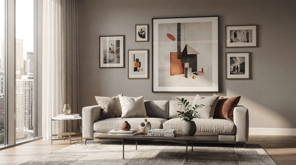
The modern image of home is no longer shaped by architecture alone. It is formed by the way light, composition, staging, and editing turn a lived-in space into a visual story that feels both desirable and believable.
In that sense, visual culture is not an abstract theory. It is the set of habits, standards, and expectations that decide how a home should look in photos, what buyers notice first, and which spaces feel calm, spacious, warm, or forgettable.
What “visual culture” means in the context of home
Visual culture describes how images influence the way people understand the world around them. In housing, that includes listing photos, architectural photography, interior editorial work, social media posts, and the visual language of design magazines and property portals.
For real estate, the practical question is simple: how does a home become legible through images?
A buyer usually sees a property before they ever step inside. That means the photo set does more than document a house. It sets expectations, frames value, and tells viewers how to imagine their own life in the space. Every frame is a quiet argument about what kind of living is possible here.
Why the image of home matters more than ever
Most people do not evaluate homes as pure floor plans. They respond to feeling first, then details. I’ve watched buyers scroll through dozens of listings, and the ones they pause on are rarely the ones with the most square footage. They pause on images that let them breathe—rooms where light falls across a floor in a way that suggests morning coffee, or a hallway that pulls the eye toward a glimpse of garden.
A strong image of home does three things:
- Shows the layout clearly
- Suggests how the space can be used
- Makes the property feel worth exploring in person
That is why a good photo is not just “pretty.” It is functional communication. It helps the viewer understand scale, flow, and atmosphere without confusion.
Real estate photography tips from major industry sources consistently point to the same basics: clean up the space, open blinds, turn on lights, keep lines straight, and photograph from angles that reveal depth and flow. Those are technical tasks, but the goal is cultural as much as technical: make the home readable and appealing. When a room reads clearly, the viewer’s brain doesn’t have to work to decode clutter or awkward proportions—it can simply imagine living there.
Home as subject, not backdrop
One useful shift is to stop treating rooms as empty containers. In visual culture, a room is an active subject. A staircase suggests movement. A kitchen suggests gathering. A sunlit corner suggests rest. I often think of a well-composed interior shot as a portrait: the space has a posture, a rhythm, a way of holding light that tells you what it’s for.
When photographing a home, ask:
- What is the room for?
- What should the viewer notice first?
- What feeling should the image create?
- What visual clutter interrupts that message?
This is where art thinking helps real estate work. Composition, texture, rhythm, and light are not decorative extras. They are tools for clarity. For instance, the grain of a wooden floor can lead the eye toward a window, while a smooth plaster wall might recede and let a piece of furniture become the anchor. Every material in the frame is either supporting the story or fighting it.
A simple example
A living room shot can either feel cramped and generic or calm and spacious.
The difference is often small:
- Pull furniture slightly away from the wall
- Remove excess objects from surfaces
- Shoot from a corner or doorway
- Keep vertical lines straight
- Use light to separate foreground from background
That approach appears repeatedly in real estate photography guidance because it works. I’d add that the corner or doorway perspective does more than show depth—it mimics the way we naturally enter a room, creating an immediate sense of invitation. And when verticals stay true, the architecture feels stable and trustworthy, which subconsciously signals that the property is well-maintained.
The modern home image is built, not found
Many listing photos look effortless, but they are usually the result of preparation. The most serene, magazine-worthy images I’ve made almost always followed a careful editing of the space before the shutter ever clicked.
Before the camera comes out, a home needs to be edited in a practical sense:
- Declutter
- Clean surfaces thoroughly
- Remove personal items
- Check all bulbs and fixtures
- Open curtains and blinds
- Balance natural and artificial light
These details matter because they reduce visual noise. A buyer should be able to focus on the property, not on a messy counter, a dark corner, or a distracting personal object. Visual noise isn’t just messy—it competes for attention and weakens the hierarchy of the image. When every surface shouts, nothing is heard.
What to remove before shooting
- Family photos
- Mail and paperwork
- Pet bowls and toys
- Cables and chargers
- Trash cans
- Bathroom clutter
- Excess decor that blocks surfaces or sightlines
What to keep visible
- Architectural details
- Natural light sources
- Clean lines and clear pathways
- Strong materials such as wood, tile, stone, or metal
- A few intentional accents that make the room feel lived in
I’ve learned that the line between “lived in” and “cluttered” is thinner than most people think. A single vase on a dining table reads as intentional; three vases, a stack of mail, and a remote control read as distraction. The goal is to leave just enough humanity so the space doesn’t feel sterile, but not so much that it feels like someone else’s private territory.
Lighting is the emotional engine
If composition is the structure of the image, light is the mood. I’ve walked into rooms that felt flat and unremarkable in person, only to see them transform on camera when the blinds were opened at the right time of day. Light doesn’t just illuminate—it sculpts. It separates planes, deepens textures, and creates a sense of air.
Natural light usually makes a home feel larger, fresher, and more open. Open blinds, sheer curtains, and properly timed shooting can transform a room that feels flat into one that feels breathable.
Practical lighting rules
| Situation | Best approach | Why it works |
|---|---|---|
| Bright interiors | Open blinds and use daylight | Keeps spaces airy and natural |
| Dark rooms | Turn on all fixtures and match bulb temperatures | Reduces color imbalance and shadowy corners |
| Window-heavy rooms | Avoid shooting directly into bright windows | Prevents blown highlights and keeps the room readable |
| Exterior shots | Use late afternoon or dusk when appropriate | Soft light adds warmth and depth |
Lighting should support the story of the room. A bright breakfast nook should feel inviting. A primary bedroom should feel restful. A bathroom should feel clean and calm. The same camera can create completely different emotional outcomes depending on when and how the scene is lit. I often schedule shoots around the path of the sun through a property, knowing that a west-facing living room will glow at 5 p.m. but look flat at noon. That kind of attention turns a competent photo into one that resonates.
Composition turns space into story
Good composition helps the viewer understand how a home is organized. When I frame a room, I’m not just trying to fit everything in—I’m deciding what the viewer’s eye will travel through first, second, and third. That sequence is the narrative.
The most effective property images usually:
- Show depth, not just a flat wall
- Include a clear path through the room
- Use corners and doorways to reveal layout
- Keep horizons and verticals level
- Avoid awkward cropping of key features
This is why professional-looking listing photos often feel easy to read. The photographer is guiding the eye on purpose. A well-placed leading line—a countertop edge, a row of pendant lights, a hallway runner—can pull the viewer into the frame and make them want to step inside.
Common composition mistakes
- Shooting too close to one object
- Cropping out important circulation space
- Hiding room function behind furniture
- Using a wide angle so aggressively that the room looks distorted
- Ignoring verticals, making walls look tilted
- Pointing the camera at clutter instead of architecture
A room should not just look bigger. It should look understandable. I’ve seen wide-angle lenses stretch a modest bedroom into something that feels cavernous but disorienting, and that confusion erodes trust. The sweet spot is where the space feels generous but still believable—where the proportions match what a visitor would experience standing in the doorway.
Visual culture and buyer psychology
Images shape more than first impressions. They influence trust.
If the visuals feel careless, buyers may assume the property has hidden issues, even if it does not. If the images feel overworked or heavily edited, buyers may worry the home will not match reality. I’ve heard agents say that a listing with overly saturated, HDR-heavy photos often generates more skepticism than excitement. People have grown visually literate; they can sense when an image is trying too hard.
That balance is central to modern property presentation:
- Clean and polished, but not fake
- Attractive, but not misleading
- Stylized, but still accurate
This is why many real estate photography guides stress that editing should improve clarity without misrepresenting the home. Good visual culture respects both aspiration and truth. The best images feel aspirational enough to inspire a visit, but honest enough that the in-person experience delivers on the promise.
Practical workflow for photographing a home
Before the shoot
- Walk the property room by room.
- Remove clutter and personal items.
- Clean glass, mirrors, counters, and floors.
- Turn on lights and replace dead bulbs.
- Open blinds and curtains.
- Decide which features should lead the story.
During the shoot
- Start with the strongest, brightest rooms.
- Photograph from corners or doorways when possible.
- Keep the camera level.
- Capture multiple angles per space.
- Check screens for distractions before moving on.
- Balance overall coverage with detail shots.
After the shoot
- Correct exposure and white balance.
- Straighten lines.
- Reduce minor distractions without altering reality.
- Keep a consistent look across the full set.
- Review the gallery as a sequence, not as isolated images.
I treat the gallery as a visual walkthrough. The order of images should mimic the experience of moving through the home: an establishing exterior shot, then entry, main living areas, kitchen, bedrooms, bathrooms, and any standout details. When the sequence flows, the viewer builds a mental map without effort.
A checklist for stronger home imagery
Use this before any listing shoot:
- Are all surfaces clean and simplified?
- Are blinds, curtains, and lights working in your favor?
- Do the photos show how each room functions?
- Are vertical lines straight?
- Is there enough visual breathing room?
- Do the images feel consistent from room to room?
- Does the set tell a clear story of the property?
If the answer to any of these is no, the image set probably needs another pass. I often do a quick mental check after the first few frames: if I squint, does the room still read clearly? If not, something is competing for attention that shouldn’t be there.
How visual culture changes real estate photography
Real estate photography used to be treated as simple documentation. Today it is closer to visual storytelling.
That shift matters because buyers now compare homes across platforms, devices, and visual styles. A listing has to perform well in a feed, in search results, on mobile, and in a full gallery. That means the images must be both informational and emotionally effective. A thumbnail on a phone screen has to grab attention in a split second, while the full gallery needs to sustain interest through a dozen frames.
In practice, this has pushed property photography toward:
- Cleaner staging
- More intentional light management
- Stronger sequencing
- More editorial composition
- Greater attention to the experience of moving through a home visually
This is where architectural and interior photography overlap with real estate work. Both depend on seeing built space as something shaped by light, material, and human use. The same principles that make a museum gallery feel contemplative—controlled sightlines, balanced illumination, a clear focal point—can make a living room feel like a place you want to linger.
What agents and photographers should remember
If the goal is to improve property presentation, the image strategy should always answer three questions:
- What is this room for?
- What should the viewer feel?
- What information must the image communicate clearly?
If those answers are built into the shoot, the final gallery will do more than advertise square footage. It will present a believable, desirable version of home. Every choice—from the angle of a chair to the warmth of a lamp—either reinforces that version or dilutes it. The most successful images are the ones where nothing feels accidental.
FAQ
What is visual culture in home photography?
Visual culture is the set of visual habits and expectations that shape how homes are photographed, presented, and interpreted by viewers.
Why do real estate photos need staging?
Staging removes distractions, clarifies room function, and helps buyers imagine how the space can be used. A well-staged room answers the question “What would I do here?” before the buyer even has to ask.
What is the biggest mistake in home photography?
The most common mistake is failing to control clutter, light, and composition at the same time. Even a nice room can look weak if those three elements are not aligned. I’ve seen beautifully designed kitchens look chaotic simply because a few small appliances were left on the counter and a shadow fell across the island.
Should real estate photos look heavily edited?
No. Editing should improve clarity and consistency, not misrepresent the property. Over-processed images often create a sense of artificiality that makes buyers doubt what they’re seeing.
What makes a listing photo feel professional?
Clean prep, balanced light, level lines, thoughtful angles, and a clear sense of room function are the main markers of a professional image. When all of these elements work together, the photo feels effortless—even though it rarely is.
Conclusion
The modern image of home is shaped by more than design trends. It is built through visual culture: the rules, habits, and expectations that tell us what a desirable home should look like.
For agents and photographers, the practical lesson is straightforward. Prepare the space carefully, use light with intention, compose for clarity, and tell the truth beautifully. When those pieces come together, a home is not just shown. It is understood. And in a market where the first viewing happens on a screen, that understanding is the moment a property becomes a possibility.