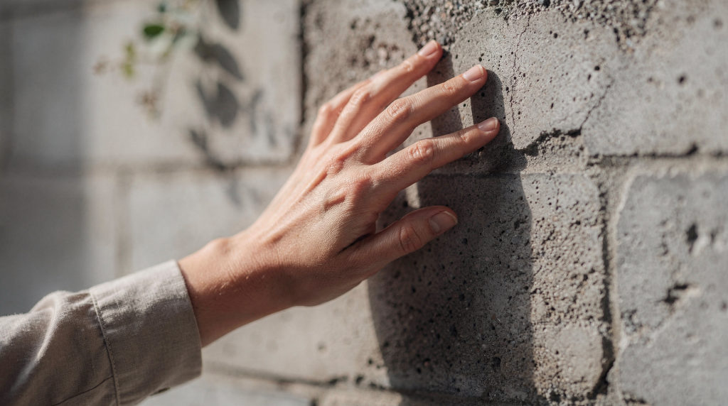
A photograph of a room can be a document, or it can be an invitation. The difference often comes down to texture — the visual language of surfaces that tells us whether a space feels warm, cold, rough, polished, lived-in, or untouched. When I walk into a property with my camera, I’m not just looking at square footage; I’m reading the walls, the floors, the fabrics. Texture is what makes those surfaces speak.
In fine art and portrait work, I learned early that texture is one of the fastest ways to make an image feel tangible. A linen curtain, a worn wooden floor, brushed metal, rough stone — each carries its own weight and story. In interiors and real estate photography, that same principle applies. When texture is handled well, viewers don’t just see a space; they sense its presence. They feel the coolness of marble, the warmth of oak, the softness of wool. Without it, even the most carefully designed room can flatten into a generic snapshot.
For photographers and agents alike, presence is what keeps an image from looking like every other listing. A smooth wall, a honed countertop, a reclaimed beam — the camera can either erase those differences or use them to build atmosphere. The choice happens in how we see light, frame the shot, and respect the materials in front of the lens.
What texture does in a photograph
Texture describes the visible surface quality of a subject: rough, smooth, soft, grainy, polished, weathered. In a photograph, texture is almost always optical rather than physical — it’s created by light, angle, and contrast, not by actual touch. That means we have enormous control over how it reads, but also a responsibility to get it right.
A photo with strong texture tends to feel more dimensional and more specific. It can:
- add visual interest where a surface might otherwise feel empty
- make a material feel real and grounded in the physical world
- guide the viewer’s eye toward or away from key elements
- support the mood of a space — rustic, sleek, intimate, expansive
- separate premium materials from ordinary ones without a single word of copy
In interior and architectural work, texture becomes part of the storytelling. Marble, plaster, woven fabric, exposed brick, oak grain, matte paint — each communicates a different design choice and a different level of care. When I’m shooting a kitchen, the difference between a polished quartz island and a honed soapstone one isn’t just about reflectivity; it’s about the tactile promise the image makes. A glossy surface might read as contemporary and precise, while a matte, slightly textured stone suggests warmth and handcraft. The camera can honor that distinction or flatten it into irrelevance.
Why texture creates presence
Presence is the sense that a subject occupies space convincingly — that it has weight, history, and a reason for being there. Texture helps because the eye reads tiny variations in tone and shadow as evidence of form. Even subtle surface detail can make a room feel closer, warmer, older, more refined, or more tactile. It’s the difference between a photograph of a living room and a photograph that makes you want to sit down in it.
Texture also gives the viewer something to “hold onto” visually. A photo with clean lines but no surface variation can feel elegant, but also distant — like a rendering rather than a real place. Adding texture often makes the image feel lived-in and believable without making it cluttered. I’ve walked into minimalist lofts where the only texture came from a single exposed brick wall or a rough-hewn wooden beam, and that was enough to anchor the entire frame.
In practical terms, texture creates presence by doing three things consistently:
- it increases depth through micro-shadows that model the surface
- it breaks up flat expanses that would otherwise feel sterile
- it gives materials a distinct identity — wood reads as wood, not just a brown shape
When I’m shooting a property, I often ask myself: if someone scrolls past this image on a phone screen, will they feel the material? If the answer is no, I know I need to adjust the light or the composition until the texture carries its weight.
The role of light: texture lives in shadow
If there is one rule to remember, it is this: texture appears when light skims across a surface, not when it hits it head-on. Side light, angled light, and raking light reveal the tiny rises and valleys that make a surface feel dimensional. This is true whether you’re photographing a plaster wall, a linen sofa, or a stone floor. The angle of light is often more important than the intensity.
Front light can be useful when you want to minimize texture — say, to keep a small bathroom feeling airy and uncluttered — but it can also make walls, fabrics, and stone look flatter than they do in person. That’s why the same room can feel rich in one image and bland in another, even if nothing in the room changed. I’ve shot the exact same kitchen at noon and then again in late afternoon, and the difference in how the wood grain and tile read was night and day.
Practical lighting cues
- Use side light to reveal grain, weave, cracks, and relief. Even a slight shift in camera position can change how the light rakes across a surface.
- Use diffused light when you want texture to remain soft rather than dramatic — overcast days or sheer curtains can be your best tools for textiles and matte finishes.
- Watch for strong glare on glossy surfaces, which can hide detail. A polished stone countertop might reflect a window instead of showing its veining; sometimes a polarizer or a slight angle adjustment is all it takes.
- Notice when shadow is doing the work of texture instead of the material itself. A deep shadow across a textured wall can create its own rhythm, and that’s worth preserving.
Where texture matters most in interiors and real estate
Texture is especially important in spaces that depend on material quality and atmosphere. A property can have excellent architecture, but if the imagery ignores texture, the design can look generic — and in a competitive market, generic doesn’t sell. I’ve seen beautifully renovated homes photographed in flat, frontal light that made custom millwork look like builder-grade MDF. The materials were there; the photographs just didn’t show them.
High-value texture zones
- kitchen stone, tile, and cabinetry finishes
- bathroom plaster, tile, and fixtures
- upholstery, cushions, and bedding
- wood floors, stair treads, and millwork
- brick, concrete, and stone walls
- window treatments and natural fabrics
In real estate photography, texture helps convey finish level without needing a spec sheet. A honed countertop reads differently from polished stone — the former feels organic and understated, the latter crisp and formal. A linen drape reads differently from polyester; the subtle slub and irregular weave signal natural fiber and quality. A reclaimed floor with saw marks and patina reads differently from manufactured laminate, even before the viewer knows the technical details. These visual cues build trust and desire, and they’re almost entirely dependent on how texture is captured.
How to shoot texture without making the image too busy
Texture is effective when it supports the frame instead of fighting it. Too much texture in every part of the image can make a photo feel visually noisy and reduce the clarity of the main subject. I’ve walked into rooms where every surface competed — patterned tile, rough brick, nubby upholstery, distressed wood — and the challenge was to let one or two textures lead while the others receded.
A simple approach
- Decide whether texture is the subject or the supporting detail. If it’s the hero, give it space; if it’s background, keep it subtle.
- Choose light that either reveals or softens the surface. Hard, raking light for drama; diffused light for calm.
- Frame so the most interesting material gets the strongest emphasis. Move closer, change your angle, or use a wider aperture to isolate it.
- Remove distractions that compete with the surface detail. This isn’t just about physical clutter — sometimes a brightly colored object pulls the eye away from the texture you want to highlight.
- Check whether the texture helps the room feel more believable. If it feels forced or chaotic, pull back.
If the room has strong architecture, let texture reinforce the structure — use the grain of wood floors to lead toward a fireplace, or the relief of a stone wall to anchor a seating area. If the room is minimal, use texture more selectively so the image stays calm and intentional. A single textured throw on a sleek sofa can do more than a dozen competing surfaces.
Composition choices that strengthen texture
Texture is not just a lighting issue. Composition determines whether the viewer notices it, and how they feel about it. The same surface can be a subtle backdrop or the entire point of the image, depending on how you frame it.
Useful composition tactics
- Fill the frame when the surface itself is the subject. A close crop of weathered wood or hand-troweled plaster can become an abstract study that still communicates the character of a home.
- Use a slight angle to add depth to flat surfaces. Shooting a tiled wall straight-on can flatten it; a subtle oblique angle introduces perspective and reveals the grout lines and relief.
- Pair smooth and rough materials to create contrast. A glossy ceramic vase on a raw linen tablecloth, or a polished metal fixture against a rough brick wall — these juxtapositions make both textures more apparent.
- Place texture near a focal point so it supports attention. If the main subject is a fireplace, let the surrounding stone or brick texture draw the eye inward rather than compete.
- Let repeating details create rhythm without overwhelming the frame. A row of shiplap boards or a herringbone floor can provide visual music, but if every inch is equally textured, the eye has nowhere to rest.
A close crop can turn texture into the main character of the image — I’ve used this often when a property has a single remarkable surface, like a hand-painted tile backsplash or a century-old door. A wider frame can use texture as an accent that makes the whole room feel more layered, like the soft fall of linen curtains framing a bright window.
Texture in different types of spaces
Different interiors call for different levels of textural emphasis. The approach that works for a cozy cottage won’t suit a minimalist penthouse, and vice versa. Understanding the space’s intent helps you decide how much texture to bring forward.
| Space type | Best texture approach | What it communicates |
|---|---|---|
| Luxury residential | Controlled, selective texture | Refinement, material quality |
| Historic property | Emphasize patina and surface variation | Character, age, authenticity |
| Minimal modern interior | Use texture sparingly | Calm, balance, restraint |
| Cozy residential space | Highlight textiles and wood | Warmth, comfort, livability |
| Commercial or lobby space | Focus on durable finishes | Permanence, scale, professionalism |
In a luxury residential setting, I’m often looking for the quiet textures — the subtle grain of rift-sawn oak, the soft hand of a wool rug, the honed finish on a marble vanity. These details don’t shout, but they accumulate into a sense of quiet opulence. In a historic property, I’ll lean into the cracks, the wear on stair treads, the uneven plaster — these aren’t flaws; they’re the visual evidence of time, and they’re often what buyers fall in love with. For a minimal modern interior, texture might be limited to a single fluted wall panel or the grain of a concrete floor; it’s there to provide just enough tactile interest without disrupting the calm. In a cozy residential space, I’ll make sure the chunky knit throw, the woven basket, and the reclaimed wood shelves all read clearly — these are the elements that say “home.” And in a commercial lobby, I focus on the materials that signal permanence: honed stone floors, brushed metal elevator doors, leather seating. The texture here is about durability and presence, not softness.
Common mistakes photographers make with texture
1. Shooting in flat light
Flat light hides surface detail and makes materials look less dimensional. I’ve seen beautiful handmade tile look like printed vinyl because the light was coming straight from behind the camera. If you can’t change the light, change your position — sometimes moving a few feet to the side is enough to catch a raking angle.
2. Over-sharpening
Extra sharpening may exaggerate texture in an artificial way. It can make walls, fabrics, and skin-like surfaces look harsh rather than tactile. The goal is to reveal what’s there, not to invent grit. I often use localized sharpening on the texture I want to emphasize, leaving smoother areas untouched.
3. Ignoring reflections
Glossy floors, glass, and polished stone can reflect windows or fixtures instead of showing their own texture. That reflection can either enhance the image — adding a subtle sheen that speaks to polish — or ruin it by obscuring the material. I always check my frame for unwanted reflections and adjust my angle or use a polarizing filter when needed.
4. Including too many competing surfaces
When every part of the frame is textured, the image loses hierarchy. The eye doesn’t know where to land. I’ve learned to ask: what’s the one texture I want the viewer to remember? Then I compose around that.
5. Treating texture as a technical afterthought
Texture should be planned during the shoot, not rescued in editing. If the light is wrong on location, post-production can only do so much without making the image look processed. I scout the light first, then place the camera where the surface reads best.
A practical checklist for texture-driven photography
Use this before or during a shoot to stay intentional about texture:
- Identify the most interesting surface in the room. It might be a stone fireplace, a plaster wall, or a worn wooden floor. Let that surface guide your decisions.
- Decide whether the texture should feel soft, strong, old, clean, or luxurious. This choice affects everything from light direction to focal length.
- Check the direction of light across the surface. Walk around it. See how the texture changes as the light angle shifts.
- Look for tonal contrast that reveals relief. Sometimes a slight adjustment in height or angle deepens the shadows just enough to make the texture pop.
- Remove objects that distract from the material. This includes small decor items that break the surface or cast confusing shadows.
- Compare a close frame and a wider frame. A detail shot might tell the story better than a full room view, especially for unique materials.
- Review whether the image feels tactile at thumbnail size and full size. If the texture disappears on a small screen, it may need more contrast or a tighter composition.
Editing texture: refine, don’t fabricate
Post-production should enhance what was already captured. Gentle local contrast, careful dodging and burning, and balanced sharpening can help surface detail read more clearly without looking processed. I often use a soft brush to add a touch of clarity to wood grain or stone veining, leaving the surrounding areas alone so the effect feels natural.
Heavy texture enhancement can make a space feel unnatural, especially in real estate imagery where trust matters. A buyer should be able to walk into the home and recognize the materials they saw online. If a honed countertop looks like it was sandblasted in the photos, something has gone wrong.
A good edit should answer one question: does the surface look more like itself, or less? If the answer is less, the edit has gone too far. I’d rather have a slightly softer image that feels honest than a hyper-textured one that feels manipulated.
Why texture supports visual storytelling
Texture makes spaces feel inhabited by material choices, not just filled with objects. That’s why it matters in visual culture as much as in real estate photography. A photograph of a room is also a photograph of decisions: what was chosen, what was preserved, what was repaired, and what was valued.
When texture is visible, the image carries more context. It gives the viewer clues about age, maintenance, craftsmanship, and mood. A worn stone step tells a different story than a pristine one. A linen curtain gathers light differently than a polyester one. These details aren’t just aesthetic — they’re narrative. They tell the viewer what it might feel like to live there, to touch the surfaces, to inhabit the light.
That is what creates presence: not only seeing a room, but sensing its character. In a market where most listings look the same, texture is one of the few tools that can make a space feel singular and true.
Key takeaways
- Texture creates presence by making surfaces feel dimensional and real, not just recorded.
- Side light and angled light usually reveal texture best because they create the micro-shadows that define relief.
- Texture works best when it supports composition instead of crowding it — let one or two surfaces lead.
- In interiors, texture helps communicate quality, warmth, and atmosphere without relying on words.
- Good texture photography is about control, not exaggeration. It’s a conversation with the material, not a special effect.
FAQ
How do you make texture stand out in photography?
Use angled or side light to create shadows that reveal surface relief. Get close enough for the detail to read clearly, and compose so the texture has visual priority — let it be the subject or a strong supporting element.
What is the best light for showing texture?
Side light or raking light is usually the most effective because it skims across the surface and creates small shadows that define every rise and valley. Overcast, diffused light can also work well for softer textures like fabric.
Can texture make a photo look better?
Yes. Texture adds depth, realism, and mood, especially in interiors and architectural images where material quality matters. It turns a flat record into an experience.
When should texture be reduced?
Reduce texture when it distracts from the subject, makes a room feel visually noisy, or competes with the clean, calm look the space requires. In minimal interiors, less texture often says more.
Is texture more important in close-up photography?
It often becomes more visible and impactful in close-up work, but it’s also important in wide interior scenes where it helps define atmosphere and material quality. Even in a full-room shot, the texture of a floor or a feature wall can set the tone for the entire image.