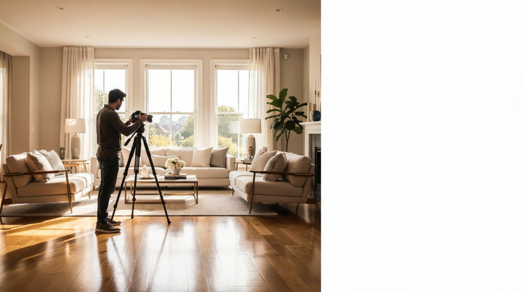
Listing photography sits at a curious intersection: it must be both a factual record and a seductive invitation. The best images don’t merely document square footage—they translate spatial experience into a single frame, making a room feel breathable, logical, and desirable before a buyer ever crosses the threshold. That translation relies on a deceptively simple sequence: prepare the environment until it reads clearly, harness light as a design material, compose each view with spatial intelligence, and edit with a conservator’s restraint. When these elements align, the photographs do their quiet work—building trust, guiding the eye, and letting the architecture speak.
Why listing photos matter
The initial scan happens in seconds, and it’s almost entirely visual. Buyers aren’t reading descriptions yet; they’re reacting to light, proportion, and a gut feeling about whether a space feels cared for. Strong listing images don’t just show a house—they reduce cognitive friction. They make the layout legible, the flow intuitive, and the atmosphere tangible. A well-photographed room reads as brighter, more expansive, and more considered, even if its square footage hasn’t changed. This is the power of visual literacy: the camera can either amplify a home’s best qualities or quietly undermine them with careless framing and harsh shadows.
A coherent real estate photo set should accomplish several things at once:
- Communicate the floor plan without requiring a blueprint
- Lead with the most compelling architectural or design feature
- Maintain a natural, unforced aesthetic that avoids the “over-processed” look
- Create enough visual breathing room for buyers to imagine their own belongings in the space
Start with preparation, not the camera
Before light or lens choice enters the conversation, the space itself must be edited. I’ve walked into too many shoots where the home was “lived-in clean” but not photographically clean—and the distinction matters enormously. The camera is a ruthless editor: it magnifies clutter, turns minor reflections into distractions, and makes visual noise feel chaotic. Preparation is essentially a curatorial act. You’re stripping away the ephemera of daily life so the permanent qualities—light, volume, materiality—can take center stage.
Room prep checklist
- Open blinds and curtains fully; natural light is your primary light source, and even partial obstruction creates uneven, muddy shadows.
- Turn on consistent lighting where needed, but be deliberate. Lamps can add warmth, but mismatched color temperatures will fight each other.
- Replace burned-out bulbs—a single dead bulb in a vanity strip reads as neglect.
- Make beds with crisp, hotel-style precision; wrinkles catch light and look messy.
- Clear countertops until only intentional objects remain. A lone bowl of fruit or a single small appliance can anchor a kitchen; a scatter of mail and keys cannot.
- Remove dishes, trash cans, and cleaning products—these items signal maintenance, not lifestyle.
- Hide personal photos and paperwork. Portraits of the current owners interrupt the buyer’s ability to project themselves into the home.
- Put away shoes, cords, pet items, and chargers. Tangled cables are visual static.
- Vacuum, dust, and wipe reflective surfaces. Even slight smudges on a stainless steel fridge become glaring in a wide shot.
- Remove or simplify busy decor. Patterned rugs and excessive wall art can fight with the room’s geometry.
- Straighten rugs, cushions, and chairs. Off-kilter elements subconsciously unsettle the viewer.
For exteriors, the same curatorial logic applies:
- Mow the lawn and edge walkways—crisp lines read as pride of ownership.
- Sweep walkways and patios; debris distracts from the entry sequence.
- Remove trash bins, hoses, toys, and tools. These objects shrink the perceived usable space.
- Park cars out of the frame entirely. A vehicle anchors the image to a specific owner and blocks architectural lines.
- Tidy patios, porches, and pool areas. Arrange outdoor furniture as if expecting guests.
The recurring mistake is assuming that “clean enough” translates to the sensor. It rarely does. The camera’s unforgiving resolution means that a stack of mail on a kitchen island becomes a focal point, not a footnote. Treat every surface as if it will be examined at gallery scale.
Plan the shot list before you shoot
A listing gallery is a narrative, not a random assortment. The sequence should mimic the mental walkthrough a buyer performs: from the moment of arrival at the curb, through the entry, and into each successive space. This predictable rhythm reduces cognitive load and creates a sense of discovery. When images jump erratically—a bathroom, then a backyard, then back to a bedroom—the viewer loses spatial orientation, and the home feels smaller and less coherent.
Typical order for listing photos
- Front exterior
- Entryway
- Living room
- Kitchen
- Dining area
- Primary bedroom
- Primary bathroom
- Secondary bedrooms
- Additional bathrooms
- Laundry, garage, office, basement, or bonus spaces
- Backyard, patio, deck, or pool
This order works because it follows the natural hierarchy of how we experience a home: public zones first, then private retreats, then functional and outdoor spaces. It also allows the gallery to build momentum, starting with the strongest curb-appeal image and moving inward. Each photo should feel like the next logical step in a guided tour.
Use the right light
Light is the invisible architecture of a photograph. It sculpts volume, defines texture, and sets the emotional temperature of a room. In real estate work, natural light is almost always your most persuasive tool—it’s free, it’s flattering, and it reads as honest. The skill lies not in adding light, but in managing its direction, quality, and consistency across a series.
Best lighting practices
- Shoot during the day whenever possible. Even well-lit artificial interiors can feel cave-like compared to a sun-washed room.
- Schedule rooms based on window orientation. Track the sun’s path through the home and plan your shoot order accordingly.
- Use soft, even daylight. Diffused light—through sheer curtains or on an overcast day—wraps around surfaces and minimizes harsh contrast.
- Avoid harsh midday sun blasting through windows. It creates blown highlights and impenetrable shadows that no amount of post-processing can fully recover.
- Keep interior light sources consistent. If you turn on lamps, make sure all bulbs share the same color temperature (ideally around 2700K–3000K for warmth).
- Turn off mixed-color lighting if it creates ugly color casts. A room lit by cool daylight from a window and warm incandescent from a fixture will produce a sickly, disjointed palette.
A practical rhythm emerges from the home’s orientation:
- East-facing rooms often look best in the morning, when soft, directional light grazes surfaces and reveals texture.
- West-facing rooms often look best in the afternoon, especially if you want that golden-hour warmth spilling across floors.
- Overcast conditions can be a gift for exteriors, acting as a giant softbox that eliminates harsh shadows and evens out exposure across the façade.
One critical discipline: avoid shooting directly into bright windows unless you’re intentionally blending multiple exposures to balance interior and exterior detail. An overexposed window becomes a featureless white void that makes the room feel smaller and the view nonexistent. If the view is a selling point, you owe it a proper exposure.
Compose rooms to feel spacious
Composition is where the photographer’s eye either earns its keep or gives the game away. A room’s perceived size, flow, and functionality hinge on where you place the camera and what you choose to include—or exclude. The goal is to create an immediate, intuitive understanding of the space without distortion or visual trickery.
Interior composition rules that work
- Shoot from corners or doorways when possible. These vantage points naturally reveal two walls and the volume between them.
- Show two walls in the frame to create depth. A single wall reads as a flat elevation; two walls give the eye a vanishing point and a sense of dimension.
- Keep vertical lines straight. Converging verticals make rooms feel like they’re falling backward or forward—an unsettling effect that undermines trust.
- Hold the camera level. A tilted horizon suggests carelessness and distorts spatial relationships.
- Include enough floor to anchor the room. Cutting off the floor too high makes furniture float and disconnects the viewer from the ground plane.
- Don’t crop important features awkwardly. A fireplace sliced in half or a window frame cut at an odd point creates visual tension without purpose.
A simple litmus test: if a viewer cannot sketch the rough shape of the room after seeing the photo, the composition has failed its primary job.
The “two-wall” or “three-wall” approach
Showing two walls is the most reliable method for conveying both scale and layout. It gives the eye a corner to anchor on and allows the room to unfold diagonally, which feels more dynamic and spacious than a straight-on shot. In larger rooms, a three-wall composition can work beautifully—it pulls the viewer deeper into the space and suggests a more complete envelope. However, in smaller rooms, three walls can feel claustrophobic, so use it judiciously.
This approach is especially effective in:
- Living rooms, where seating arrangements and flow matter
- Bedrooms, to show the relationship between bed, windows, and circulation
- Kitchens, where the work triangle and counter space need to read clearly
- Home offices, to demonstrate functionality and light quality at the desk
Camera height and angle matter
One of the most pervasive errors I see in listing photography is camera height that ignores human perception. Shooting from too high—say, eye level of a standing adult—can make ceilings feel low and furniture squat. Shooting from too low distorts proportions and emphasizes the underside of tables and chairs. The sweet spot is typically around chest height (roughly 4.5 to 5 feet), which approximates how we visually experience a room when we’re moving through it. This height keeps verticals manageable, maintains a natural relationship between floor and ceiling, and avoids the “dollhouse” or “looming” effect.
- Position the camera roughly at chest height for most interiors.
- Keep the horizon level—use a tripod’s bubble level or in-camera grid.
- Avoid tilting the camera upward or downward unless you have a specific, intentional reason (such as emphasizing a vaulted ceiling or a dramatic staircase).
When the camera sits at this natural height, the resulting image feels grounded and trustworthy. Buyers subconsciously recognize the perspective as their own, which makes it easier for them to imagine inhabiting the space.
What gear do you actually need?
You don’t need a medium-format system or a bag full of tilt-shift lenses to produce compelling listing photos. But you do need a setup that gives you control over geometry, exposure, and consistency. The right tools remove variables and let you focus on seeing.
Helpful gear
- Camera with manual settings: Full manual control over aperture, shutter speed, and ISO is non-negotiable. You need to dictate depth of field and exposure, not the camera’s auto modes.
- Wide-angle lens: Something in the 16–24mm range (full-frame equivalent) allows you to capture the room’s volume without excessive distortion. Avoid fisheye lenses—they sacrifice credibility for coverage.
- Tripod: A sturdy tripod is the single most underrated piece of real estate photography gear. It locks in your composition, eliminates camera shake in lower light, and ensures consistent verticals across every frame.
- Extra batteries: Long shoots with frequent chimping drain power. Running out of battery mid-session breaks your rhythm and can compromise the light.
- Memory card with enough capacity: Shoot RAW if possible; those files are larger but give you far more latitude in editing. A fast, high-capacity card prevents interruptions.
- Microfiber cloth for lens and reflective surfaces: A smudge on the front element can soften an entire set. Also useful for wiping down mirrors, faucets, and glass tabletops just before the shot.
A tripod, in particular, transforms the workflow. It forces you to slow down, consider the frame, and make deliberate choices. It also enables longer exposures in dim rooms without pushing ISO to noisy levels, preserving the clean, airy look that buyers respond to.
Use a wide-angle lens carefully
A wide-angle lens is a double-edged tool. It opens up tight spaces and reveals the relationship between zones, but it also stretches reality if mishandled. The line between “spacious” and “misleading” is thin, and crossing it erodes the trust that listing photos depend on.
How to avoid distortion
- Do not over-shoot corners. Placing the camera too close to a corner exaggerates the width of that corner and makes adjacent walls appear to bow.
- Keep the camera level. Tilting the lens up or down introduces keystone distortion, where vertical lines converge. This can be corrected in post, but it’s better to minimize it in-camera.
- Correct lens distortion in editing. Most wide-angle lenses have some barrel or mustache distortion; lens profiles in software like Lightroom can neutralize it.
- Don’t place key vertical edges near the frame edge if they bend visibly. The edges of the frame are where distortion is most pronounced. Keep important lines—door frames, cabinet edges—closer to the center.
- Stay wide enough to show the room, but not so wide that the home looks misleading. If a 10×12 room reads as a ballroom, you’ve gone too far.
The goal is to make a room feel true to its proportions. A photograph that slightly compresses space is more honest—and ultimately more effective—than one that inflates it beyond recognition.
Photograph each room with intention
Every room in a listing carries a specific narrative burden. The living room must convey gathering and comfort; the kitchen, efficiency and cleanliness; the primary bedroom, retreat and calm. Approaching each space with a clear intention prevents the gallery from becoming a monotonous parade of wide shots. One image might establish the overall layout, while a second focuses on a material detail—a marble backsplash, a window seat, the way light falls across a hardwood floor.
What to capture in each space
| Space | What the photo should show |
|---|---|
| Living room | Layout, seating flow, natural light, focal point (fireplace, view, built-ins) |
| Kitchen | Counters, appliances, island, clean surfaces; emphasize work zones and materiality |
| Bedrooms | Bed placement, natural light, usable floor area; show the relationship to windows and closets |
| Bathrooms | Vanity, tile, shower or tub, cleanliness; reflections should be controlled, not chaotic |
| Dining area | Table scale, connection to adjacent rooms; suggest how the space functions during meals |
| Laundry / utility | Storage, organization, practicality; even utilitarian spaces benefit from tidy composition |
| Office / flex room | Function, light, work surface; show how the room can adapt to remote work or study |
| Exterior | Curb appeal, entry, landscaping, architecture; include context that situates the home in its environment |
Avoid repetitive angles that add no new information. If two shots from slightly different corners tell the same story, choose the stronger one and move on. Each image should earn its place in the sequence.
Exterior photos need a different approach
The exterior shot is the handshake. It sets the tone for everything that follows and often determines whether a buyer clicks through to the gallery at all. Unlike interiors, where you’re managing contained light, exteriors demand attention to the broader environment: sky, landscaping, hardscape, and the way the structure meets the ground.
Exterior tips
- Shoot when the light is soft. Early morning or late afternoon light skims across façades, revealing texture and giving the home a three-dimensional presence.
- Use an angle that shows depth. A straight-on elevation can look flat and institutional; a slight angle reveals the side plane and creates a more dynamic composition.
- Include front walkways, porches, or architectural details. These elements guide the eye toward the entry and establish a sense of arrival.
- Keep the house centered without flattening it. The structure should feel grounded, not floating or cut off.
- Remove visual clutter from the frame. This includes cars, bins, hoses, and anything that distracts from the architecture.
For curb appeal, a slightly angled front shot usually works better than a straight-on snapshot. It shows more dimension and hints at the side yard or the depth of the lot. If the home has a notable landscape feature—a mature tree, a garden path—use it to frame the composition and add layers.
Edit for accuracy, not fantasy
Post-processing should be invisible. Its job is to remove barriers between the viewer and the space—correcting color casts, straightening lines, balancing exposure—not to fabricate a version of the home that doesn’t exist. When editing crosses into fantasy, it doesn’t just mislead buyers; it undermines the credibility of the entire listing. The most elegant edits are the ones you never notice.
Safe editing adjustments
- Straighten vertical lines and correct keystone distortion
- Correct lens distortion using a proper lens profile
- Balance brightness and contrast so windows aren’t blown and shadows retain detail
- Adjust white balance to neutralize unnatural color casts (e.g., overly warm incandescent or sickly green fluorescent)
- Remove minor distractions—a stray leaf on a counter, a reflection of the tripod in a mirror
- Reduce color casts selectively, especially on ceilings and walls where mixed light can create odd patches
Editing mistakes to avoid
- Over-brightening shadows until the room looks flat and artificial. Shadows give depth; eliminating them makes spaces feel weightless.
- Changing sky color too aggressively. A gray day turned electric blue reads as dishonest immediately.
- Removing permanent features. That awkward column or radiator is part of the home; erasing it is a misrepresentation.
- Making grass unrealistically green. Hyper-saturated lawns look like astroturf and raise suspicion.
- Replacing windows with fake views. Buyers will notice the discrepancy during a showing, and trust evaporates.
- Over-sharpening textures. It introduces halos and makes surfaces look crunchy, not crisp.
Buyers are visually literate in ways they might not articulate. They sense when an image feels “off.” Good editing preserves the integrity of the space while presenting it in its best possible light—literally and figuratively.
A simple workflow for photographing a home
A repeatable workflow is the backbone of consistent results. It removes guesswork, keeps you efficient, and ensures that no critical shot is missed. Over time, this sequence becomes second nature, allowing you to focus on the nuances of each property rather than the mechanics.
Step-by-step process
- Walk the property and identify best features. Note where the light falls, which angles feel most expansive, and any architectural details worth highlighting.
- Check window light and plan your room order. Map the sun’s trajectory against the floor plan so you’re shooting each room when it’s at its best.
- Prep and clean each space. Do a final sweep for stray items, crooked furniture, and reflective smudges.
- Turn on or off lights to create consistency. Decide on a lighting strategy for the whole home—all ambient, all natural, or a balanced mix—and stick with it.
- Set up the tripod and camera level. Use the bubble level and grid overlay; check verticals against door frames.
- Shoot wide, then add detail shots where needed. Start with the establishing shot, then move in for material or feature close-ups.
- Review for vertical lines, clutter, and exposure. Zoom in on the LCD to catch reflections, crooked art, or blown windows.
- Edit for accuracy and consistency. Apply a uniform treatment across the set so the gallery feels cohesive.
- Build the gallery in a logical order. Follow the narrative sequence from exterior to backyard.
This workflow saves time and reduces the need for reshoots. More importantly, it produces a set of images that feel intentional rather than haphazard.
Common mistakes to avoid
Even experienced photographers can fall into these traps. They’re often the result of rushing, cutting corners, or losing sight of the buyer’s perspective. Awareness is the first step toward avoiding them.
- Photographing before the home is truly ready. A rushed prep shows in every frame. Take the extra 20 minutes to clear surfaces and straighten linens.
- Using mixed lighting that creates odd color. A room half-lit by daylight and half by tungsten reads as jaundiced. Commit to one temperature.
- Shooting from random heights. Inconsistent camera height across rooms disorients the viewer and breaks the visual flow of the gallery.
- Cropping too tightly. Leaving no breathing room around furniture makes spaces feel cramped and incomplete.
- Including too much empty wall or ceiling. A composition that’s 40% blank ceiling wastes valuable frame real estate and dilutes the room’s impact.
- Ignoring window glare. Reflections of the camera, tripod, or photographer in glass doors and windows are distracting and unprofessional.
- Publishing too few images. A sparse gallery leaves questions unanswered. Buyers want to see every space that matters.
- Over-editing the final gallery. When the post-processing becomes the subject, the home recedes. Restraint is a sign of confidence.
A listing photo set should feel complete, clean, and trustworthy. Every decision—from prep to final export—should serve that outcome.
Quick checklist before delivery
Before you upload or hand off the final images, run through this checklist. It’s a final quality-control pass that catches the small things that can undermine an otherwise strong set.
- Exterior included (front, and ideally rear or side if relevant)
- Entry included
- Main living areas covered
- Kitchen shown clearly from at least one strong angle
- Primary bedroom included
- At least one photo of every bathroom
- Outdoor areas included when relevant (patio, deck, pool, garden)
- Vertical lines corrected across all images
- Exposure consistent across the set—no jarring jumps in brightness
- Final images are sharp and natural, free of obvious artifacts or heavy-handed edits
FAQ
How many photos should a listing have?
Enough to tell the story of the property without repeating angles. A typical single-family home might need 20–35 images to cover every major room, key details, and exterior views. The guiding principle is completeness: if a buyer would wonder about a space, include it. But avoid padding the gallery with near-duplicate frames; redundancy dilutes the impact of the strongest shots.
Should all lights be on or off?
Use whichever option creates the cleanest, most consistent look across the entire home. Mixed lighting is the real enemy—when a room is lit by both daylight and warm lamps, the color temperature clash creates an unappealing, disjointed palette. If natural light is abundant and even, turning off artificial sources often yields a fresher, more cohesive result. If you do use lamps, ensure all bulbs match in color temperature and that they don’t create harsh hotspots on walls or furniture.
What time of day is best for real estate photos?
Late morning to early afternoon often works well for interiors because the sun is high enough to fill rooms without casting long, distracting shadows. For exteriors, softer light—early morning or late afternoon—brings out texture and avoids the harsh contrast of midday. The ideal time ultimately depends on the home’s orientation and window placement. A west-facing living room might look best in the afternoon; an east-facing kitchen, in the morning. Scout the property beforehand if possible to map the light.
Can a phone camera work for listing photos?
Yes, for very simple situations where the goal is a quick, informal snapshot. But a dedicated camera with manual controls, a quality wide-angle lens, and a tripod gives you dramatically better consistency, dynamic range, and room coverage. Phone sensors struggle with high-contrast scenes (like bright windows next to dark interiors) and often produce distorted verticals that are difficult to correct perfectly. If the listing matters—and most do—the investment in proper gear pays for itself in buyer perception.
How much editing is too much?
If the home looks materially different from reality, the edit is too heavy. The test is simple: would a buyer who viewed the photos and then walked through the front door feel misled? If the answer is yes, dial it back. Clean up distractions, balance exposure, correct color—but don’t remove permanent features, alter the view, or push saturation to cartoon levels. The most effective editing is the kind that no one notices.
Conclusion
Photographing a home for a real estate listing is, at its core, an exercise in visual control. Control the light so it flatters without deceiving. Control the composition so spaces read as coherent and generous. Control the visual noise so the architecture—not the clutter—holds the frame. When you prepare the space with a curator’s eye and photograph it with a documentarian’s integrity, the listing transcends mere documentation. It becomes a quiet, persuasive argument for why this house, this light, this flow might be exactly what someone is looking for. And that argument, made well, is what turns a casual browser into a scheduled showing.